Eight Summits
Project Brief
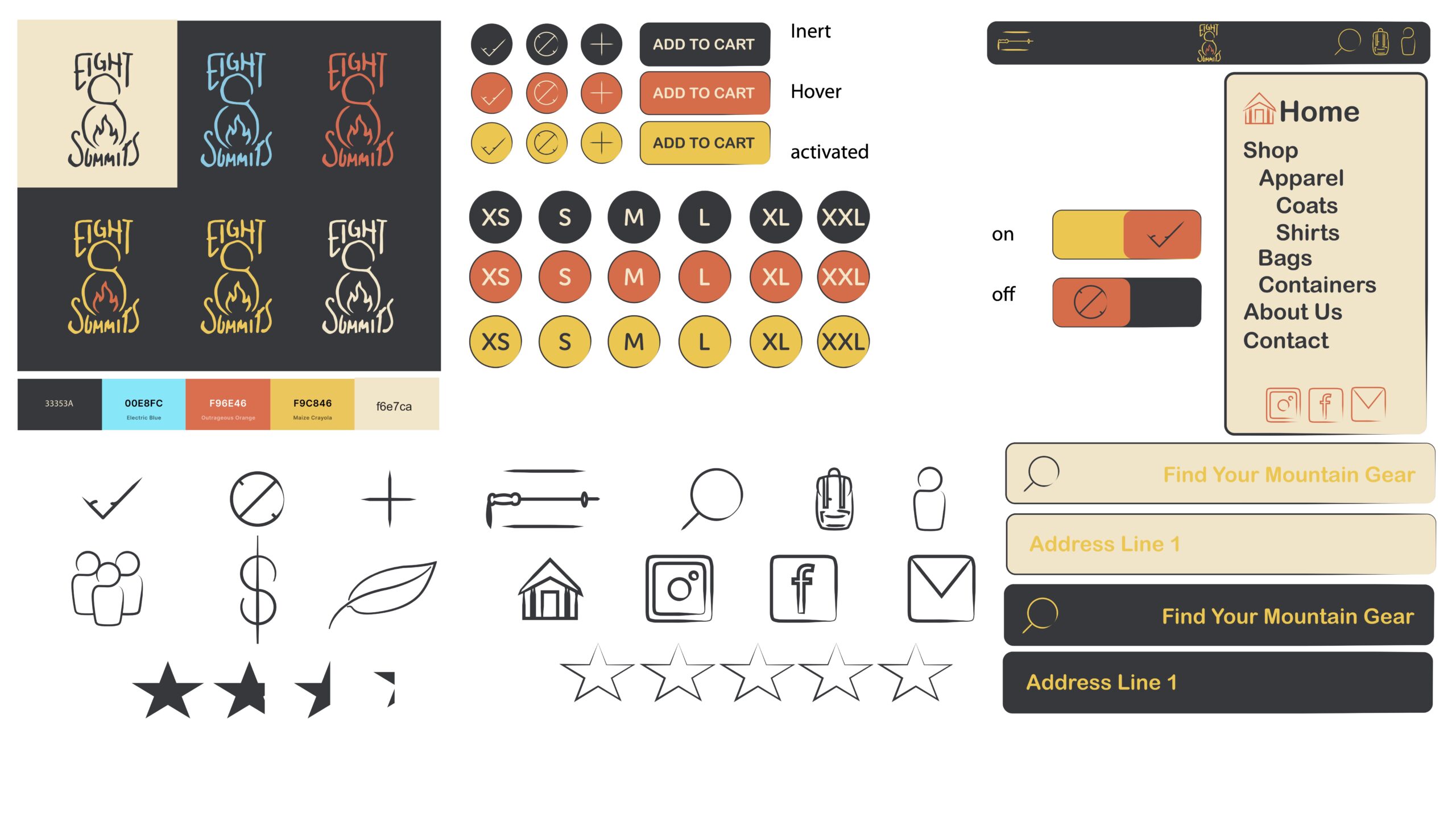
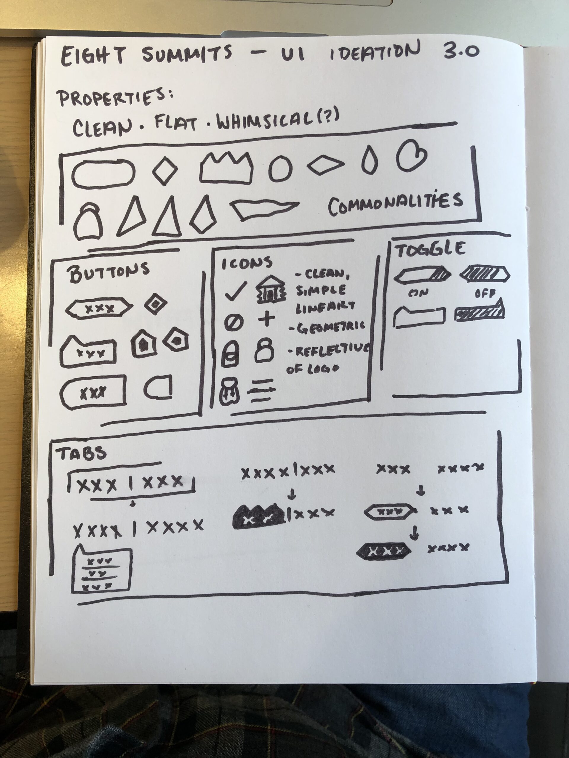
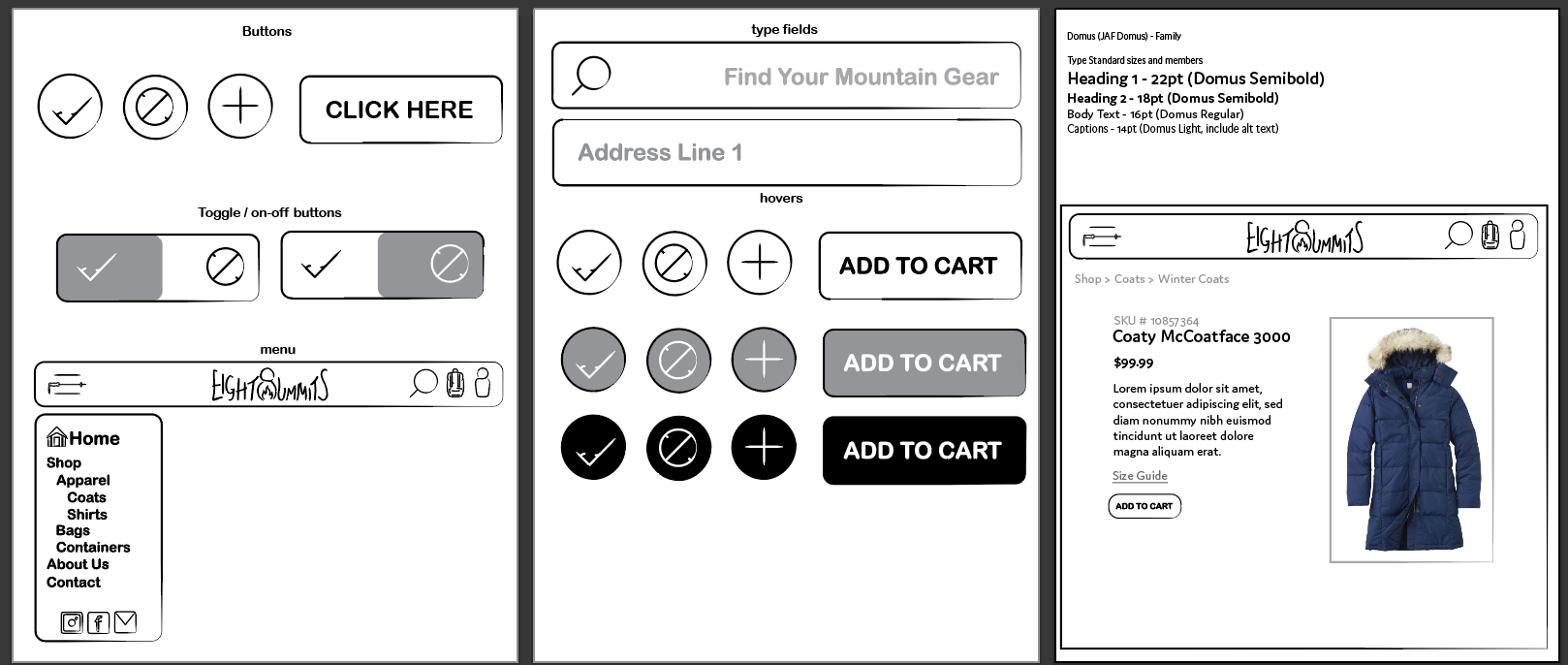
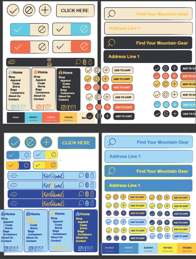
The assignment that Eight Summits was the result of had two points of focus. The first focus was to become familiar with the contents of a UI kit, the process of creating a UI kit, and how to implement said UI kit to streamline a User’s Experience. I designed a brand system and UI kit from scratch, and then as part of the assignment used these resources to create three separate emails to landing page to checkout flows, meant to simulate the guided buying experience used by many brands today.
The second focus was to create a user experience that was disability-friendly. Like Off the Pedestal, Eight Summits was checked against the WCAG color-checker, given a dyslexic-friendly font, and designed with minimal clutter.
The result was Eight Summits: An outerwear brand designed to be accessible, affordable, and good for the environment.
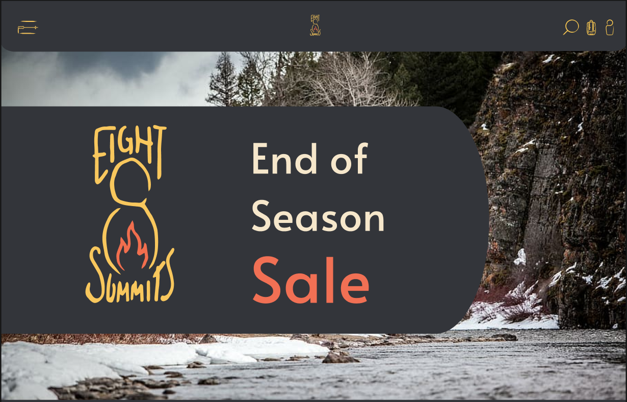
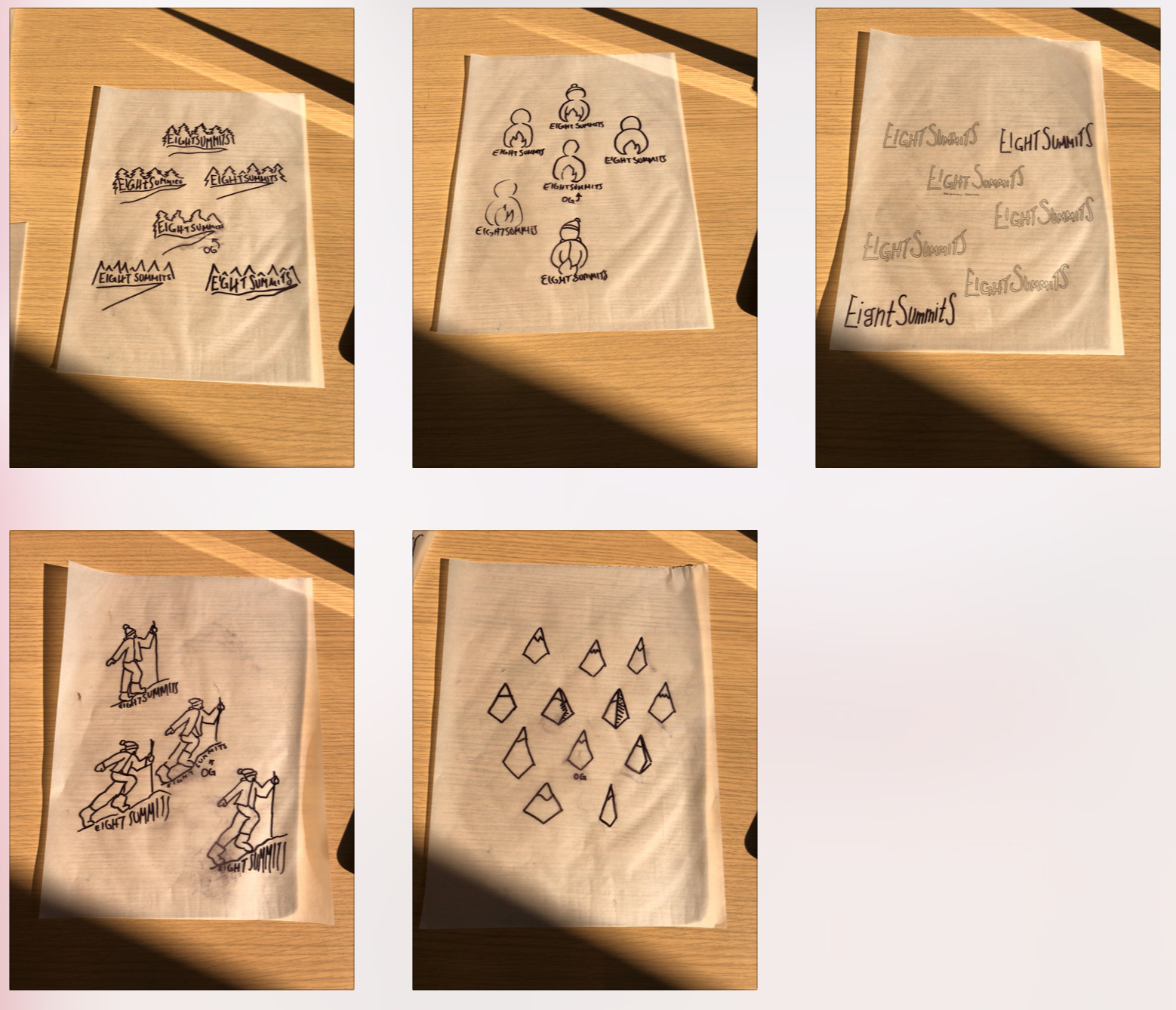
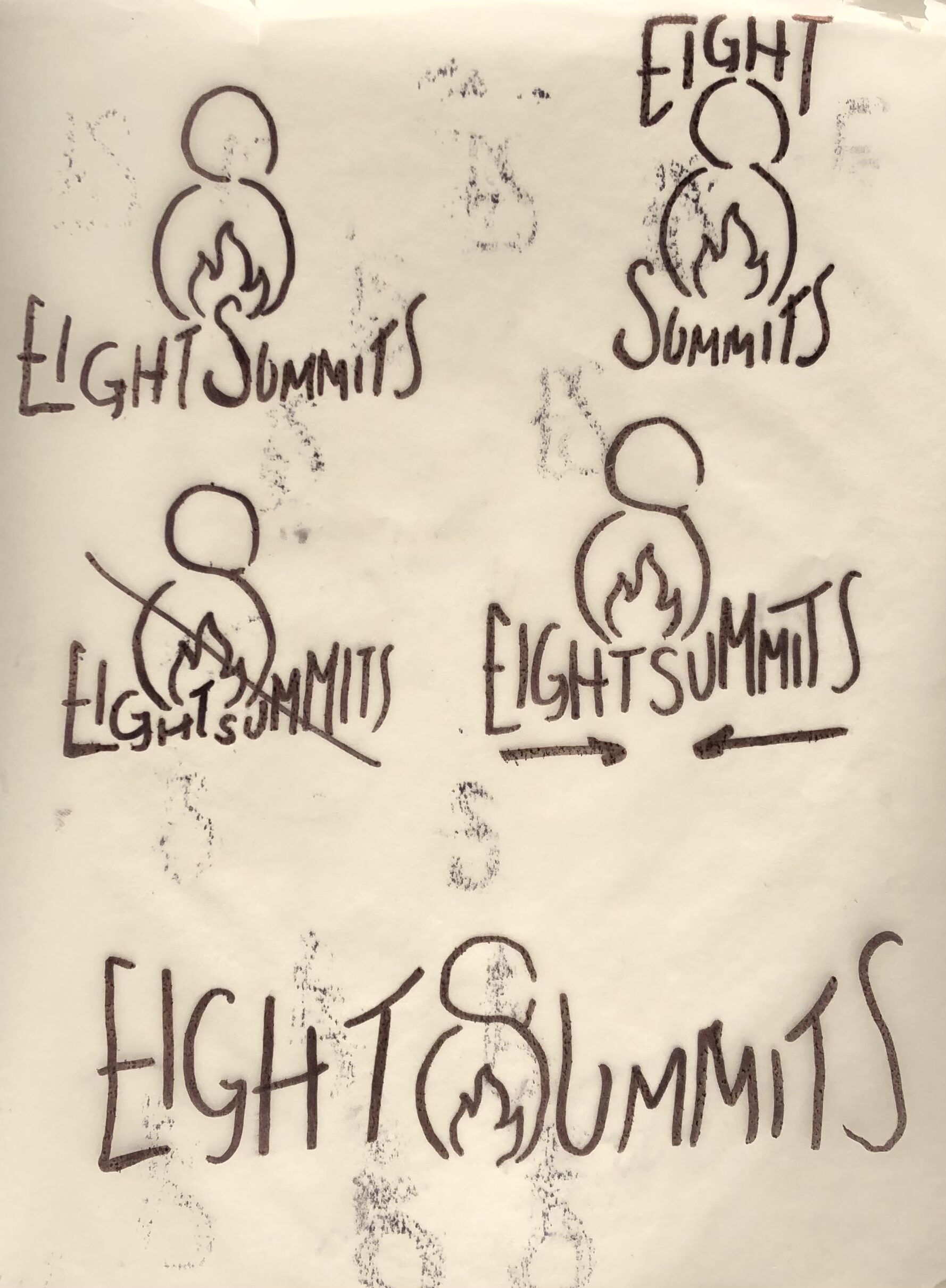
Logo Process
UI Kit Process
Email to Landing Page to Checkout Flows
Emails
Landing Pages
Checkout
—
See Something You Like?
Time For A Sale!
Back In Stock!
Abandoned Cart / Customer Recapture Flow
Sale Announcement
Restock Announcement
Landing Page
Simulated Checkout
You can also view the Landing Pages and Checkout at the link below.
