Athens-Epidaurus Festival
Project Description
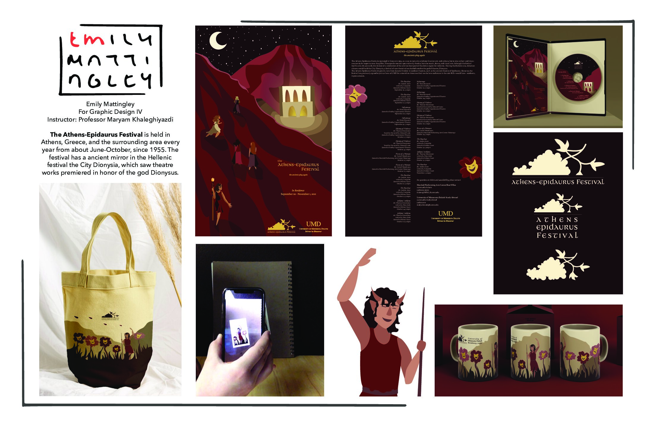
The aim of this project was to imagine what it would look like if an international festival came to Duluth. The end goal was to have a poster, a mascot, some merch to be sold, and an element with AR augmentation. For my take on this project, I chose the Athens-Epidaurus Festival.
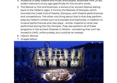
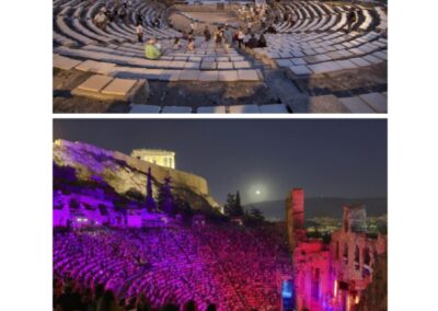
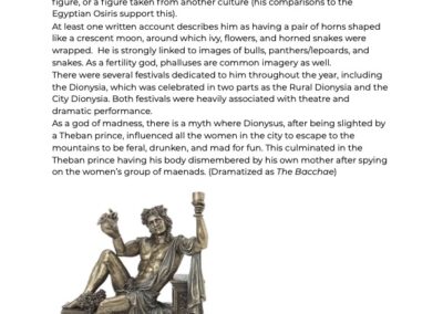
The Athens-Epidaurus Festival in its current iteration has a history of about 65 years. However, the festival has much deeper roots spanning back to Ancient Greece with the City Dionysia. The City Dionysia was not a city, but rather a weeklong theatre festival held in Athens to honor the greek god of theatre, wine, madness, and ecstasy, Dionysus.
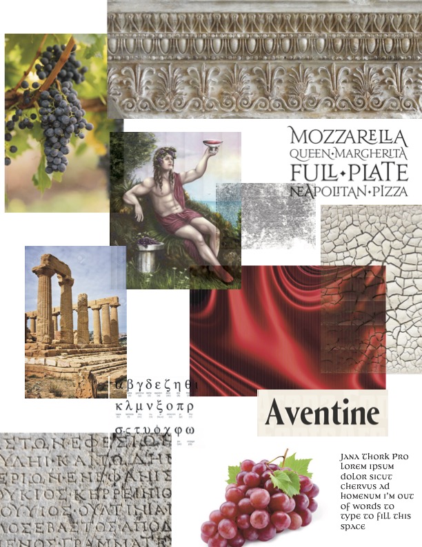
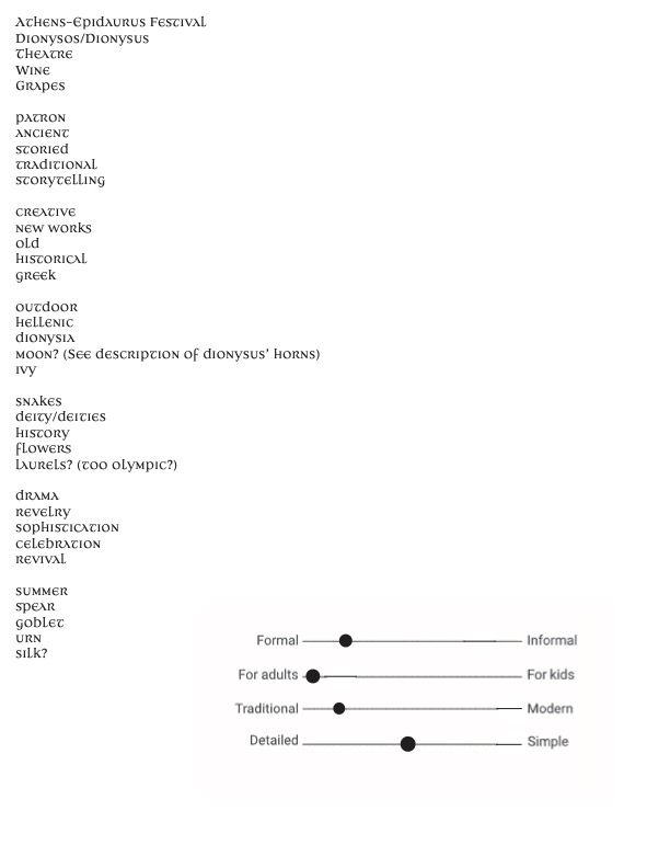
As with every project, we begin with background research. You can view the reseach and finished project gallery at the end of this section.
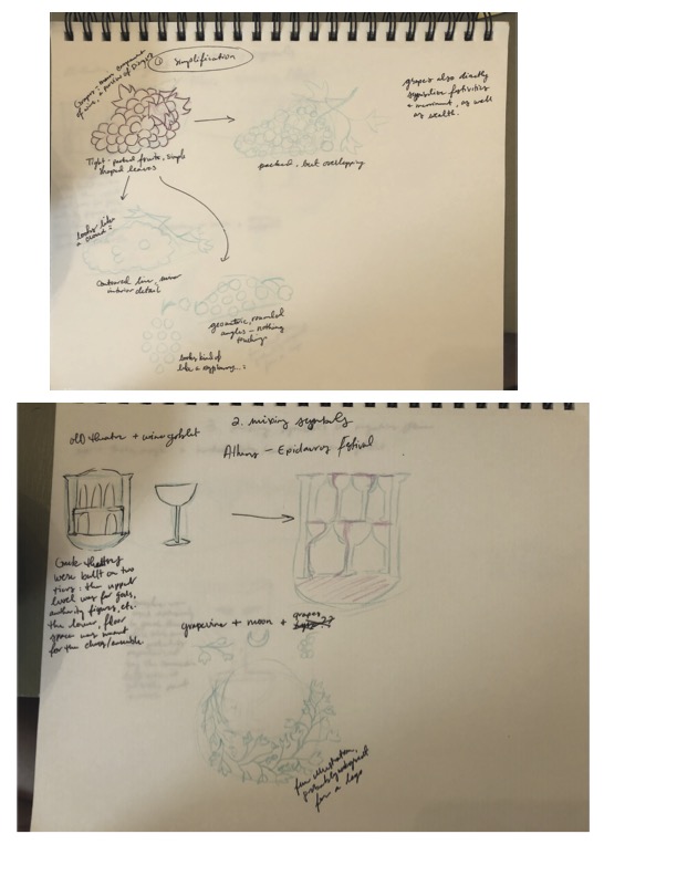
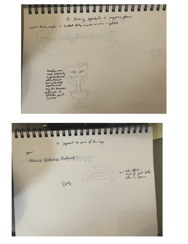
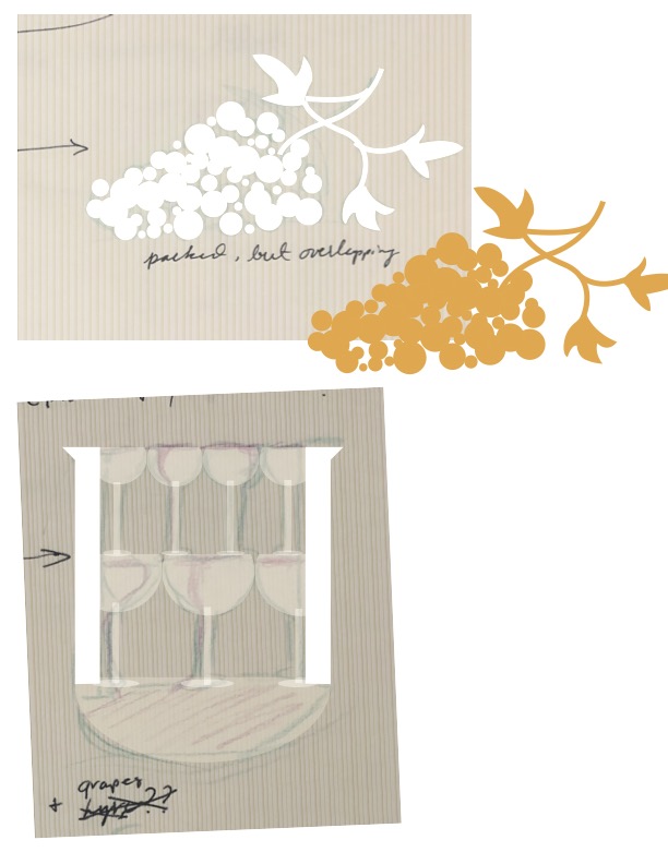
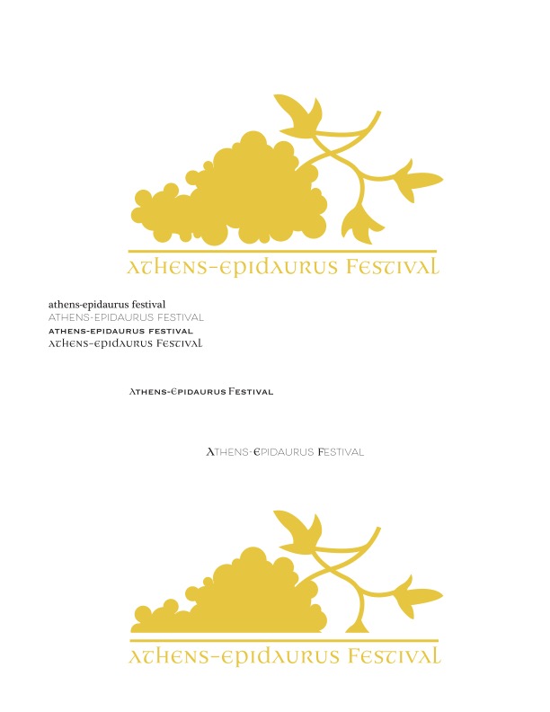
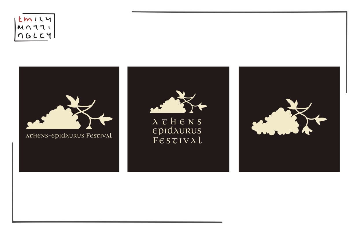
Logo Creation
Poster (Quarto)
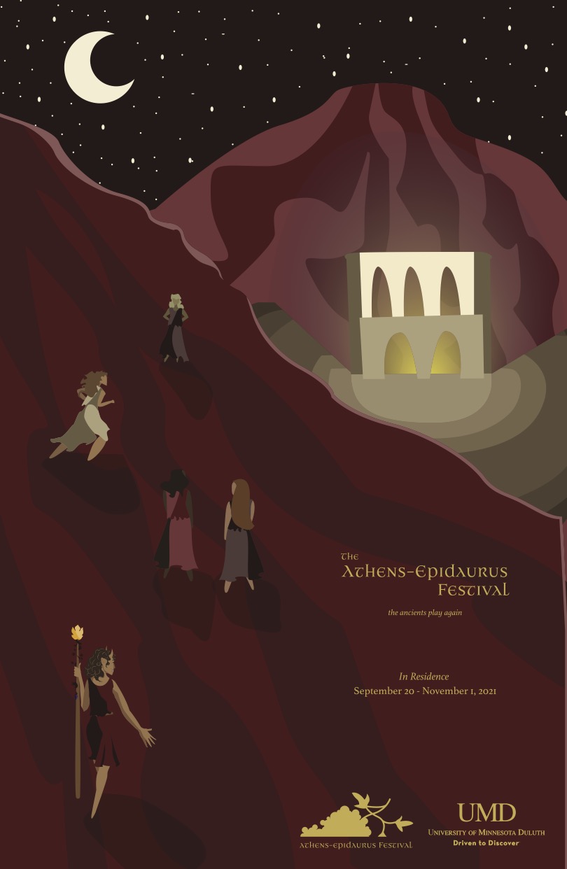
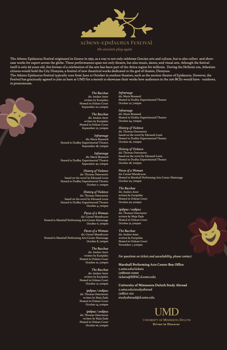
Next point was to create a poster for the festival, but with a catch – this poster had to be able to fold into fourths and still have the most necessary information visible. This information could be on the front or back. Considering the nature of my festival (plays going almost constantly for a week), I knew I’d need most of my back poster for plays, locations, and start times. So, front it would be.
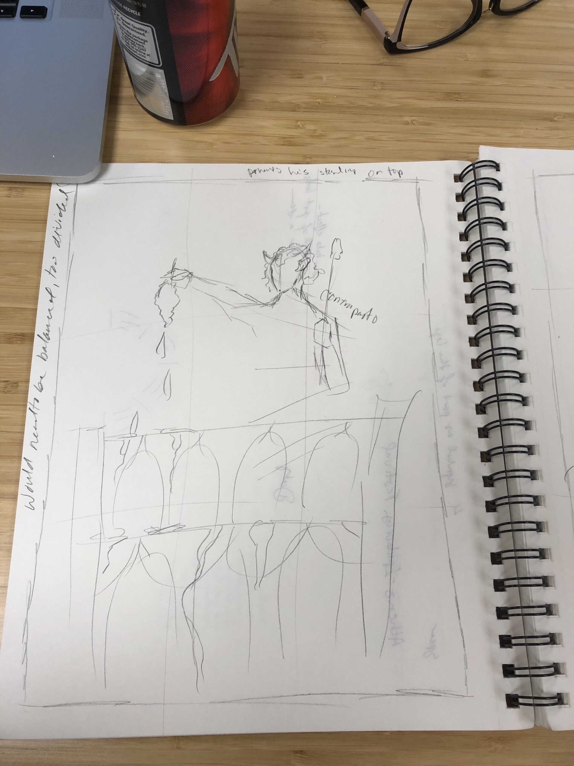
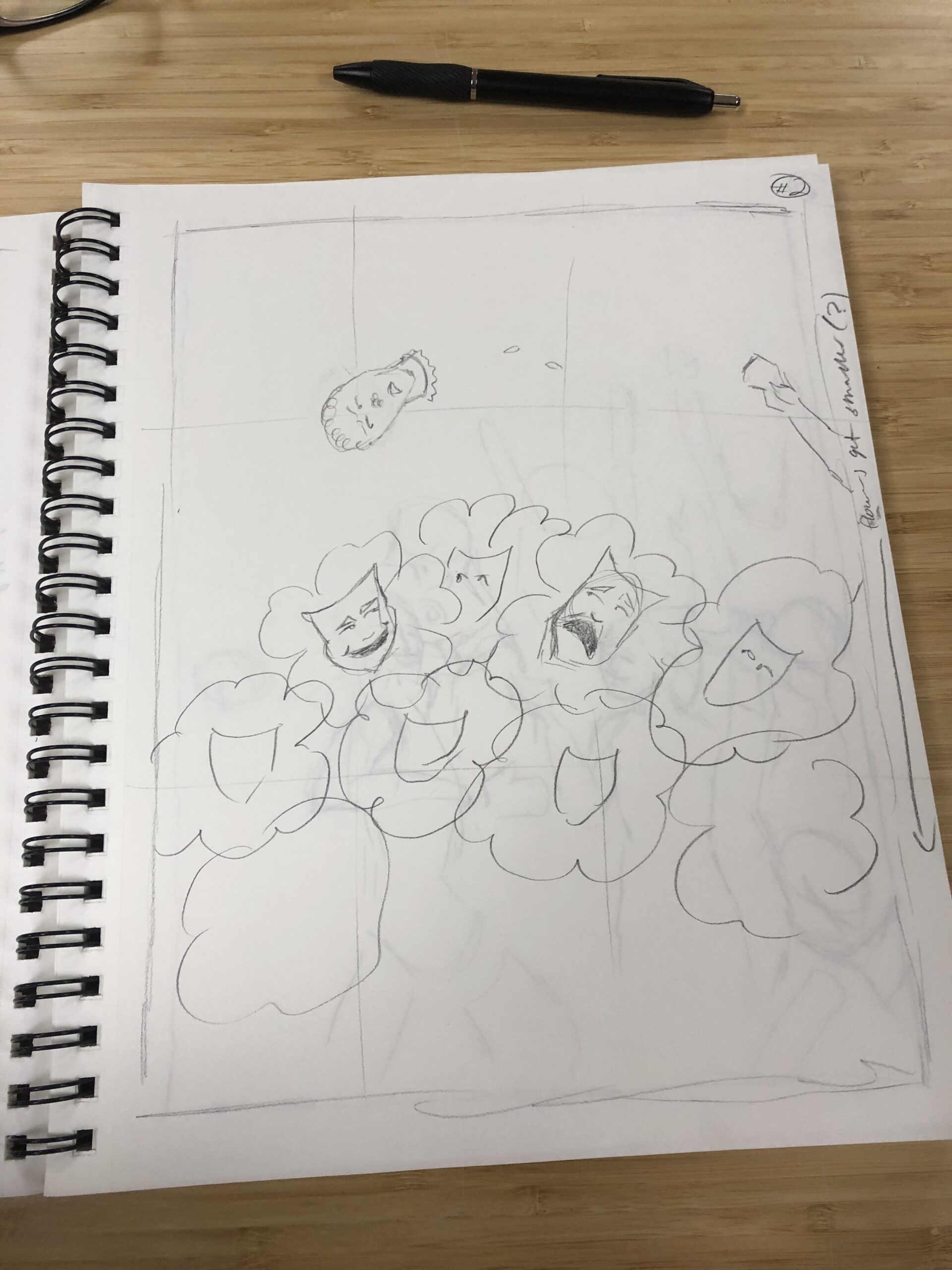
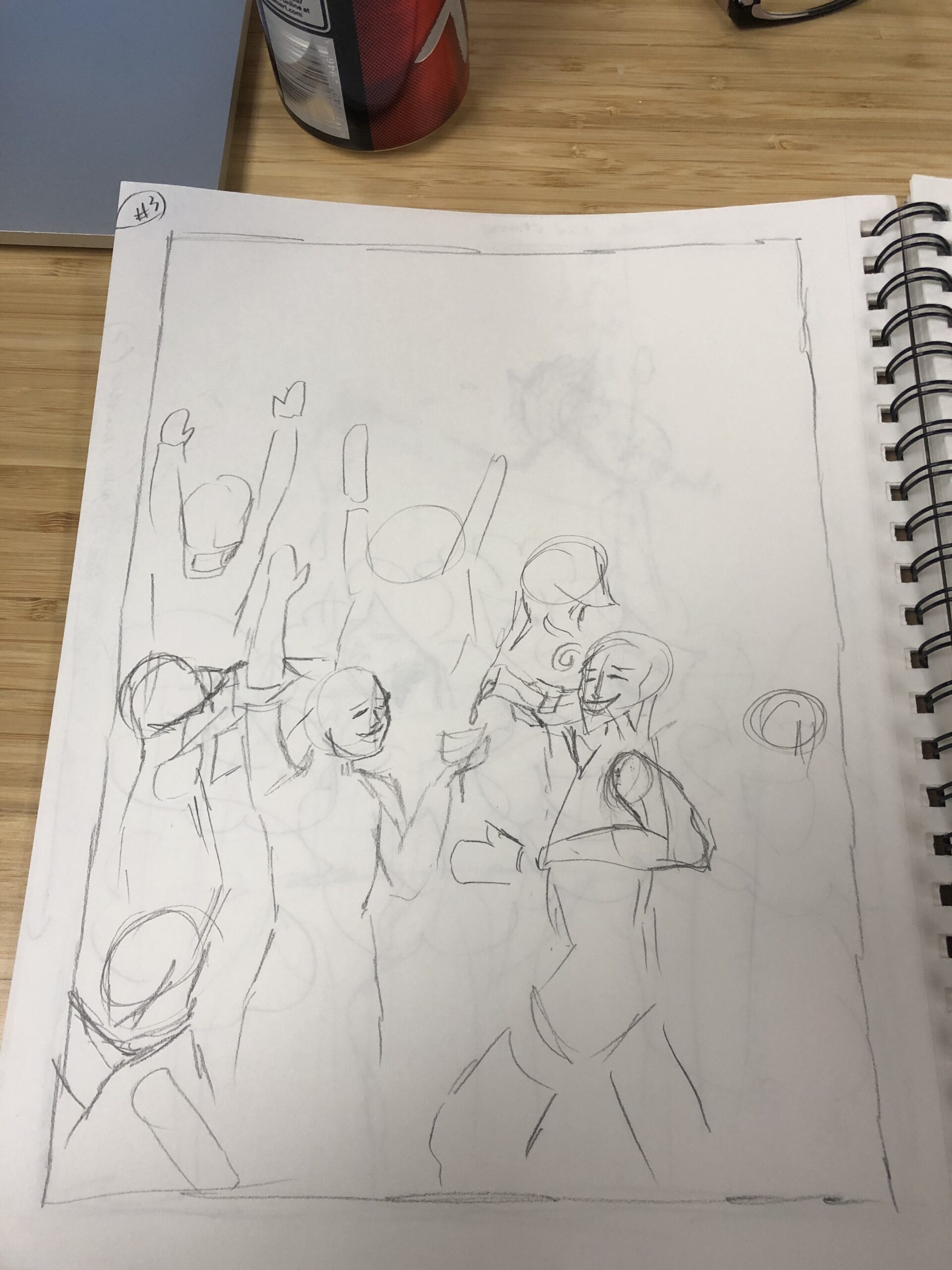
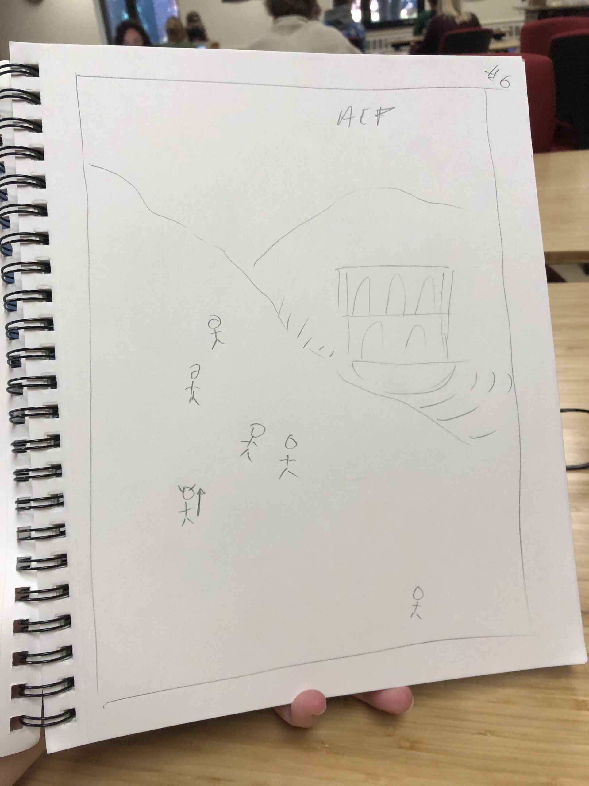
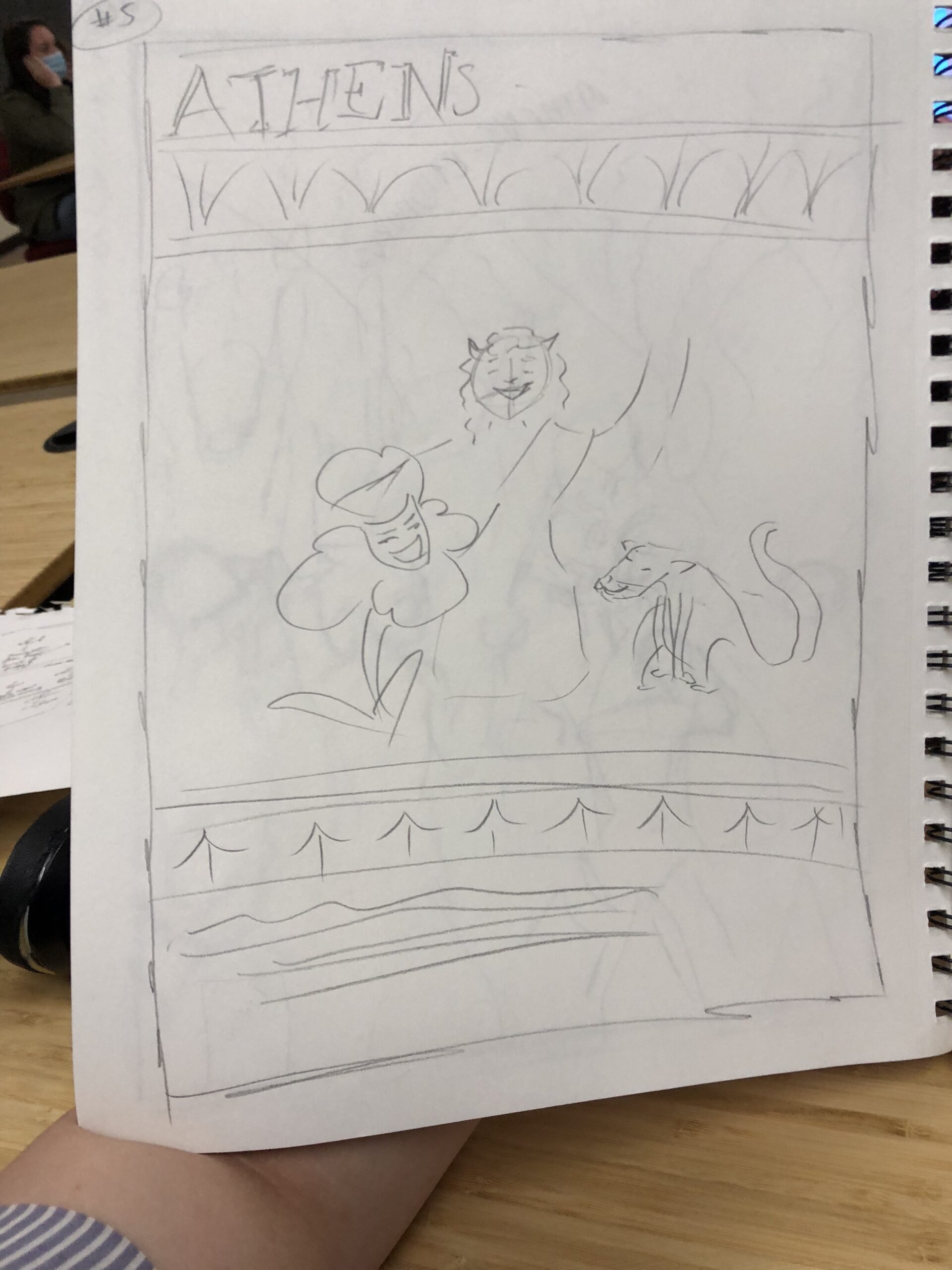
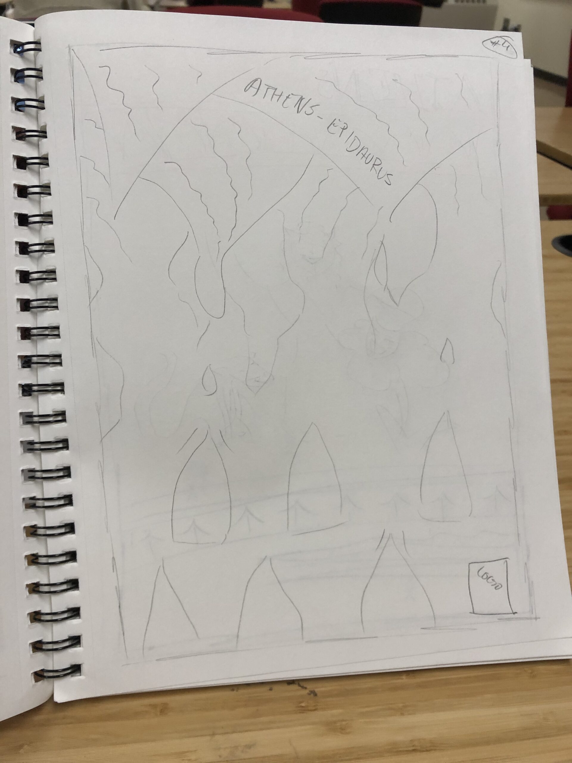
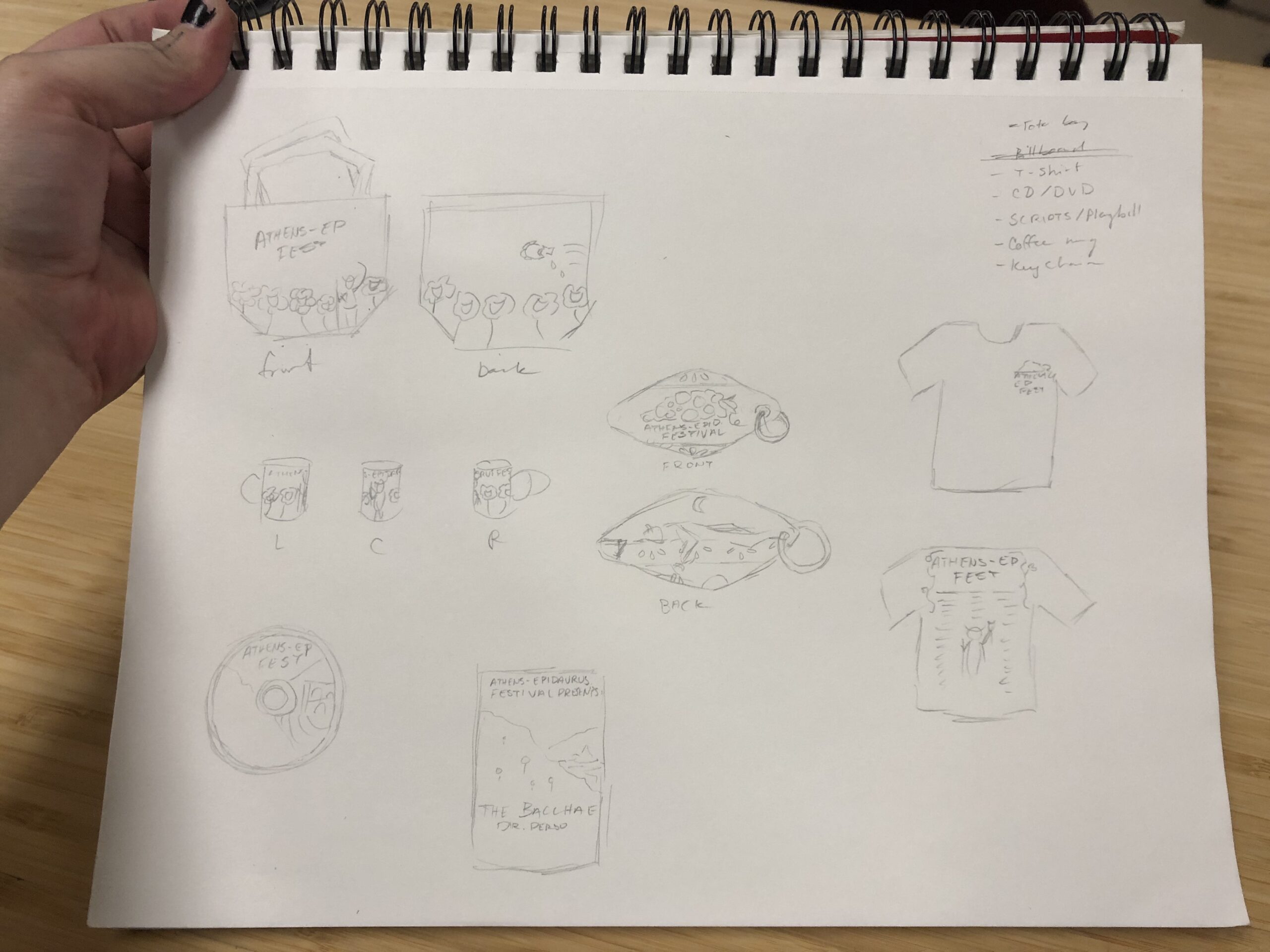
First, I created some concepts with little thought to the quarto aspect. I wanted to not hamper my creativity too quickly, and knew if I really liked a concept I could figure out a solution for the quarto aspect. I created six concepts, three of which could be easily converted to a quarto-favorable design. Like I note in my slides, the some of the discarded concepts got second lives with the merchandise.
Once I picked a direction, it was pretty straightforward. I don’t have any in-progress shots, but the final poster came out perfectly.
Merchandise
When creating merchandise for this project, I was thinking about the audience that would be coming. Likely, there would be two groups: Theatre patrons age 55 and above, technology-resistant; and college kids, broke, utilitarian-minded. This guided the choices I made as far as to what to offer.
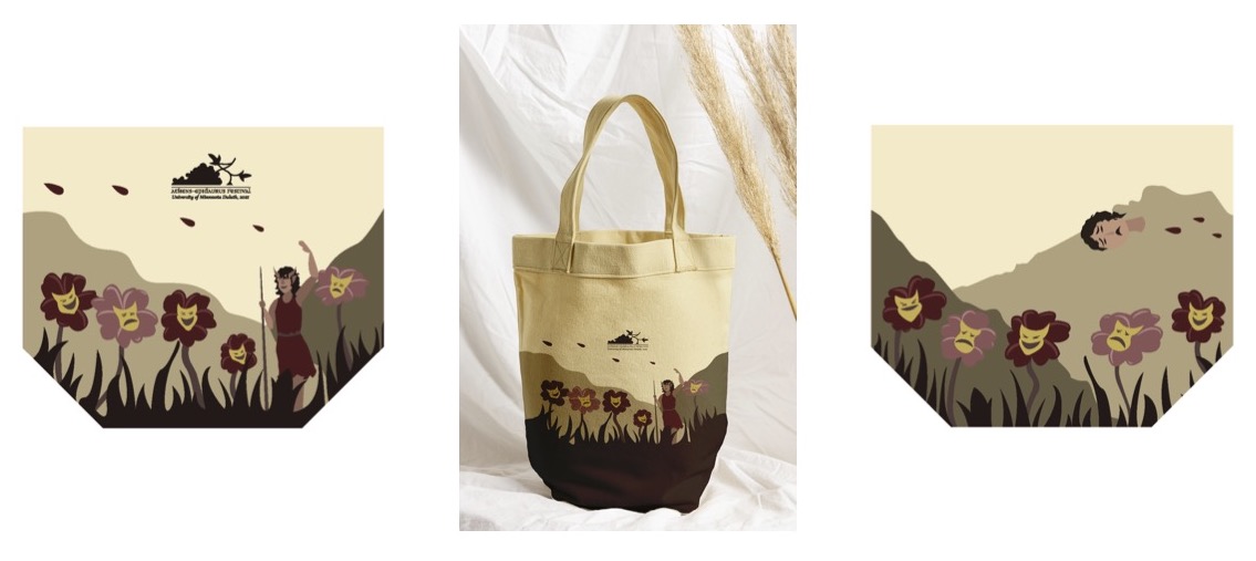
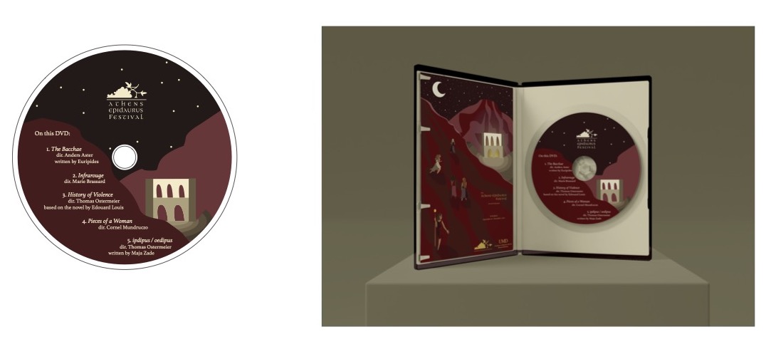
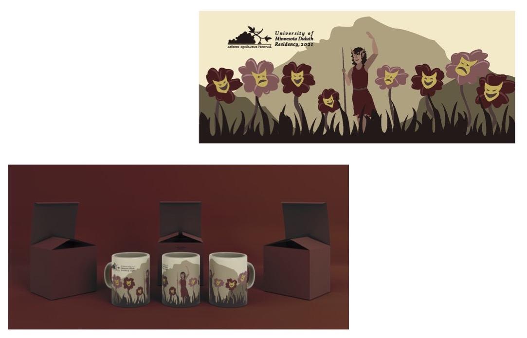
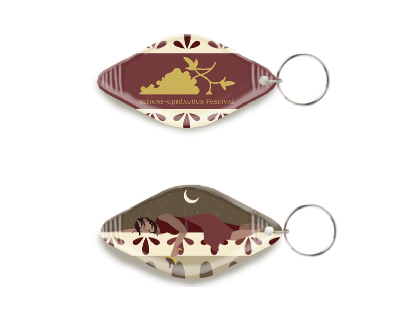
The DVD might seem like an odd choice on the surface, but for older folk who are technology resistant (and trust me, in Duluth, a lot of them are), a DVD is a known technology they can use. For the college kid, they may want to buy merch, but have a limited budget. A small keychain can bridge that gap. As for a coffee mug or canvas bag, those might be spendier in the eyes of a college student, but they serve a purpose. Especially in Duluth, since they implemented a 5 cent tax on plastic bags.
But there is one more merch item that necessitates its own section.
Augmented Reality Sticker
Powered by Artivive.com, we were able to bring a merch object of ours to life using Augmented Reality. I chose to create a sticker, and to give you a scope of other items augmented, others did their poster, a ticket, a button.. all flat items.
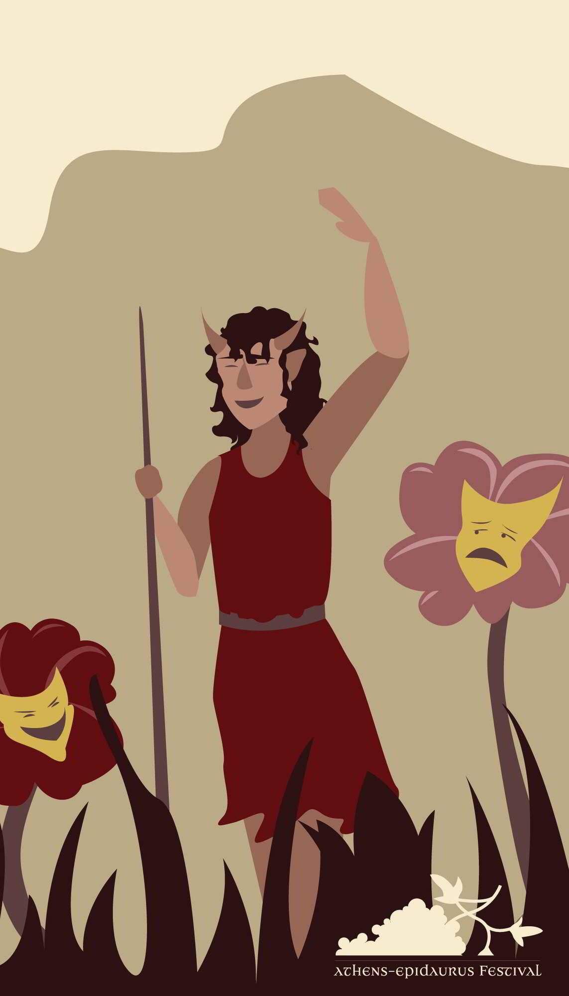
The sticker I made used the same illustrative concept as the bag and mug. I broke the illustration down from its illustrator file, imported it to photoshop, and made a gif. Then, using Artivive, the still image used for the sticker and the gif were uploaded. Then, after printing the sticker, we were able to use the Artivive app to view the Augmented Reality version. The best part? If you download the Artivive app (it should still be free?) and scan the still image of the sticker on here, you should be able to view the AR yourself! (Not too many times though… they’ll make me give them money 🙁 )
If you can’t (or don’t want to) download the app, you can view the video of the AR in motion as well.
