Barebones Identity System
Project Brief
I joined Barebones as the Marketing and Graphics Director shortly after its inception in August of 2019. Before we were able to work on our first show, we needed an identity.
Barebones was a student founded and run theatre production company on the University of Minnesota Duluth campus. Barebones’ goal was to put up student works on a shoestring budget – a “bare bones” production, quite literally. We reflected this in our brand identity by sticking to a grayscale palette and simple design and graphics.
You may be wondering about the fate of Barebones, given the inception date. We had one production set for the year before the pandemic hit. Barebones was able to host a zoom-based one-act show in the Spring of 2020, which we imaginatively called Zooomfest (not a typo), but ultimately Barebones ceased production efforts after 4/5 members graduated in Spring of 2021, before COVID restrictions were fully lifted.
Responsive Logo Systems
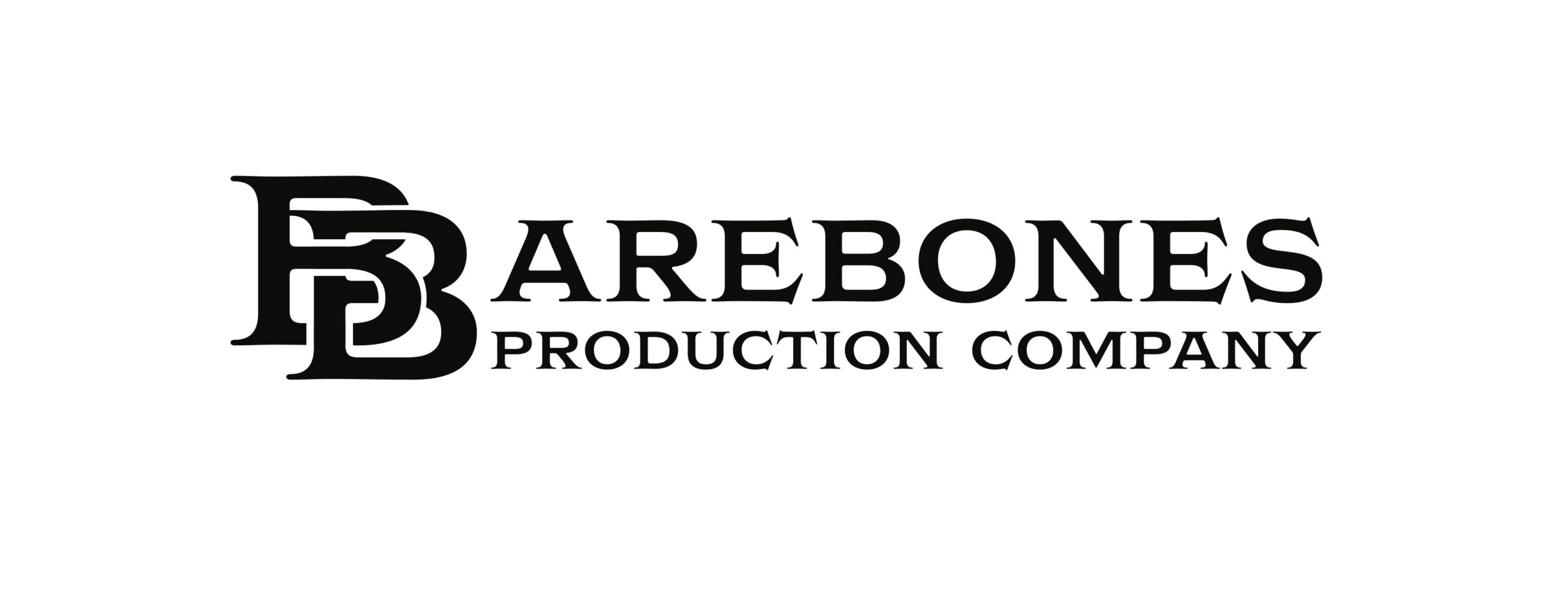
This image has been added to the portfolio for explanation purposes only. This is not my art, it is from jhspecialty.com. Clicking on the picture will take you to the original page this image was featured on.
When creating the Barebones Identity system, it was clear to me that our logo would likely end up on a variety of items, from posters and tickets to t-shirts and buttons. As such, the logo would need to be legible and recognizable at different sizes and distances. So, we could either go with a simple logo that would look good at a lot of sizes, or we could do a Responsive logo.
Responsive or Scaling logos are a kind of logo that reduces the amount of detail in the design as the intended size use gets smaller. Popular Responsive logos would be Levi’s, or the Disney logo, with and without the Castle. We did the same with Barebones. Like Levi’s and Disney, I made sure we had a focal point to keep in mind as we scaled to our smallest size. For Barebones, that was the intertwined double B.
Barebones Responsive Logo
Largest Logo
Medium Logo
Small-use Logo
Logo in Action
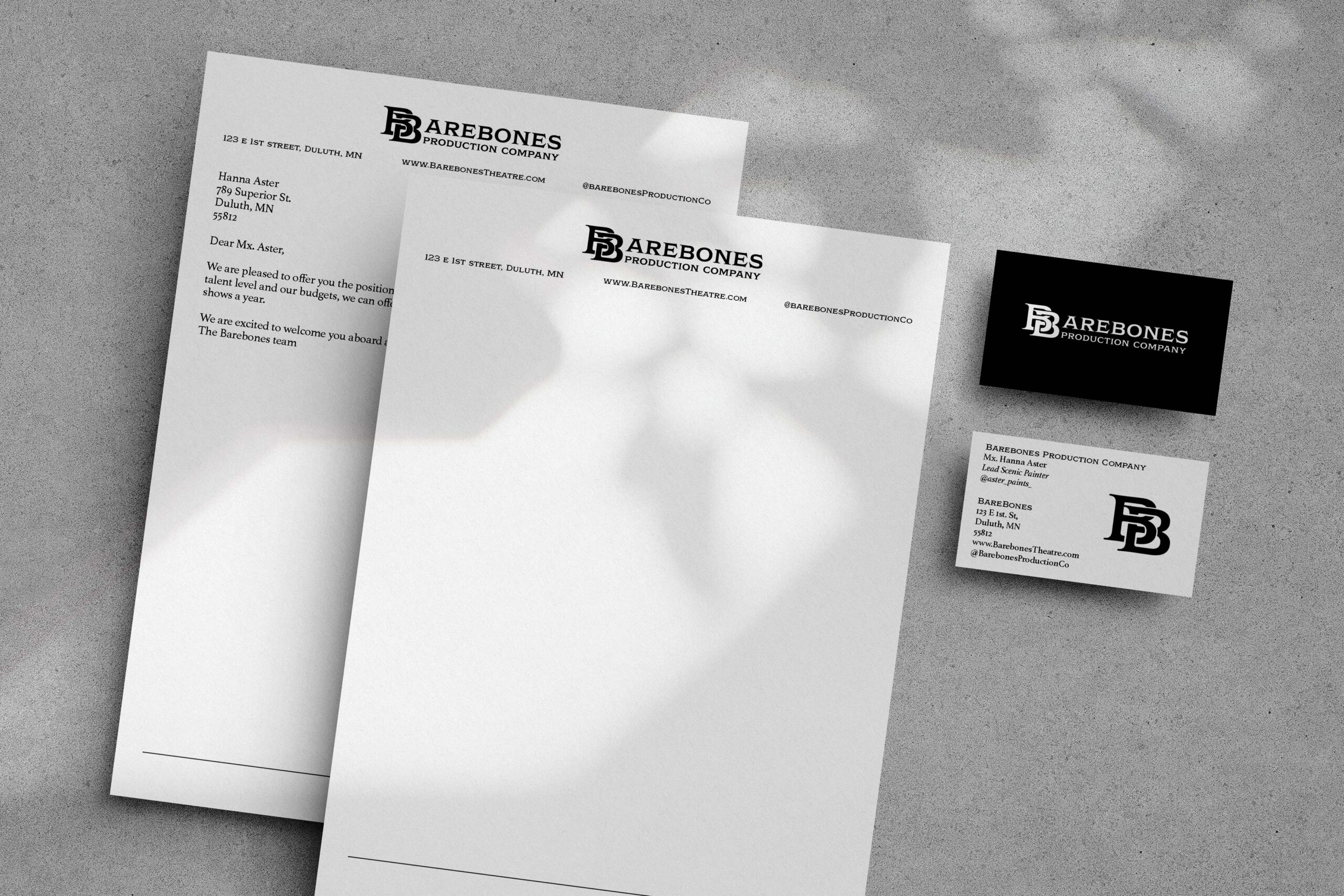
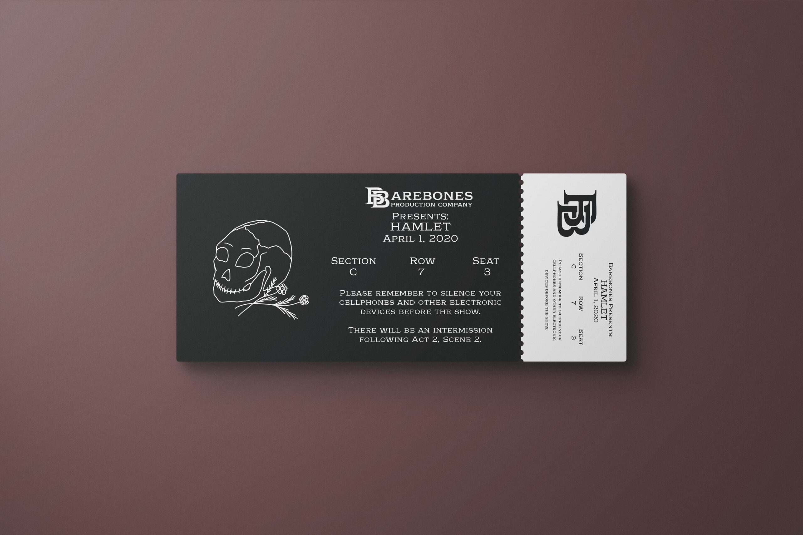
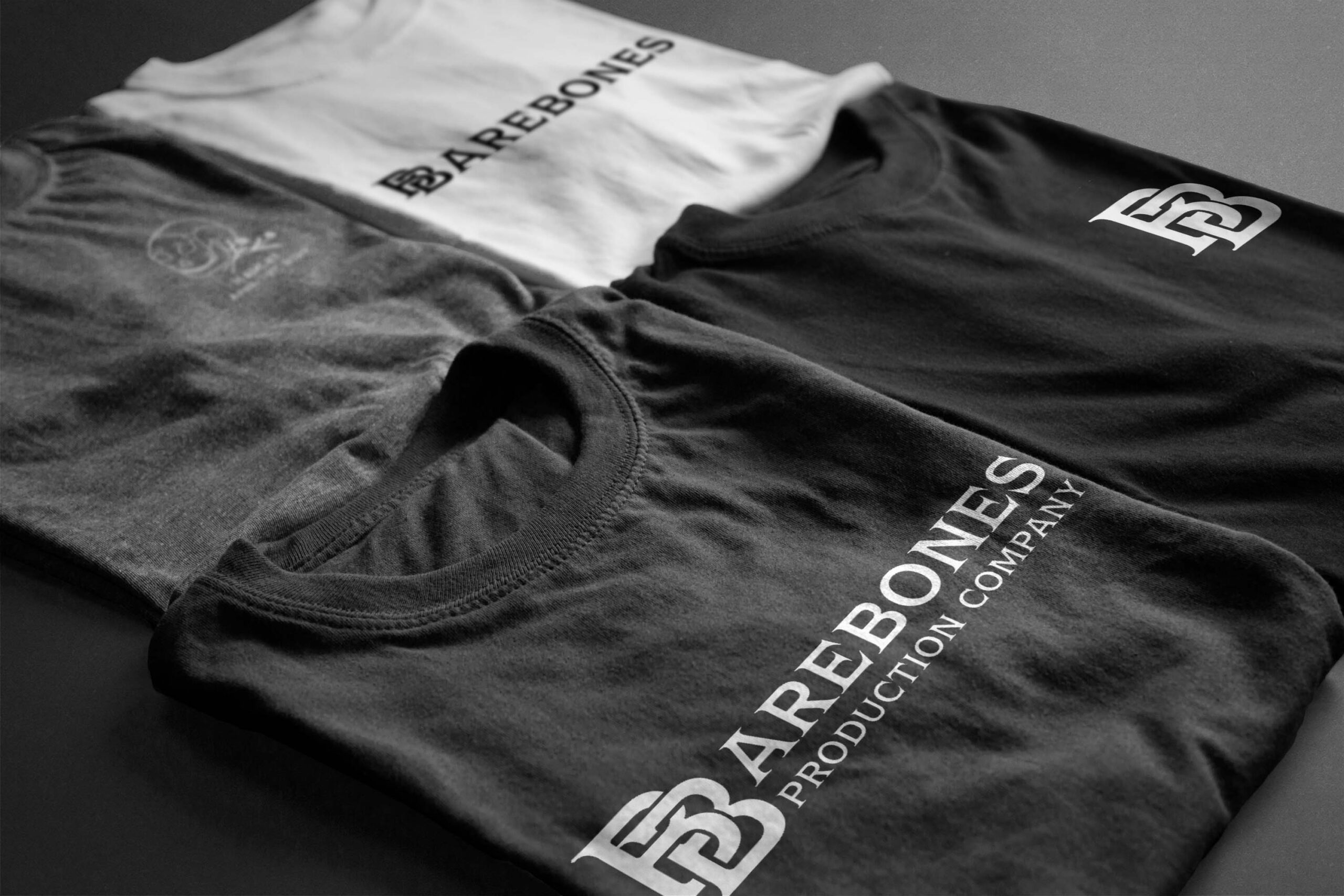
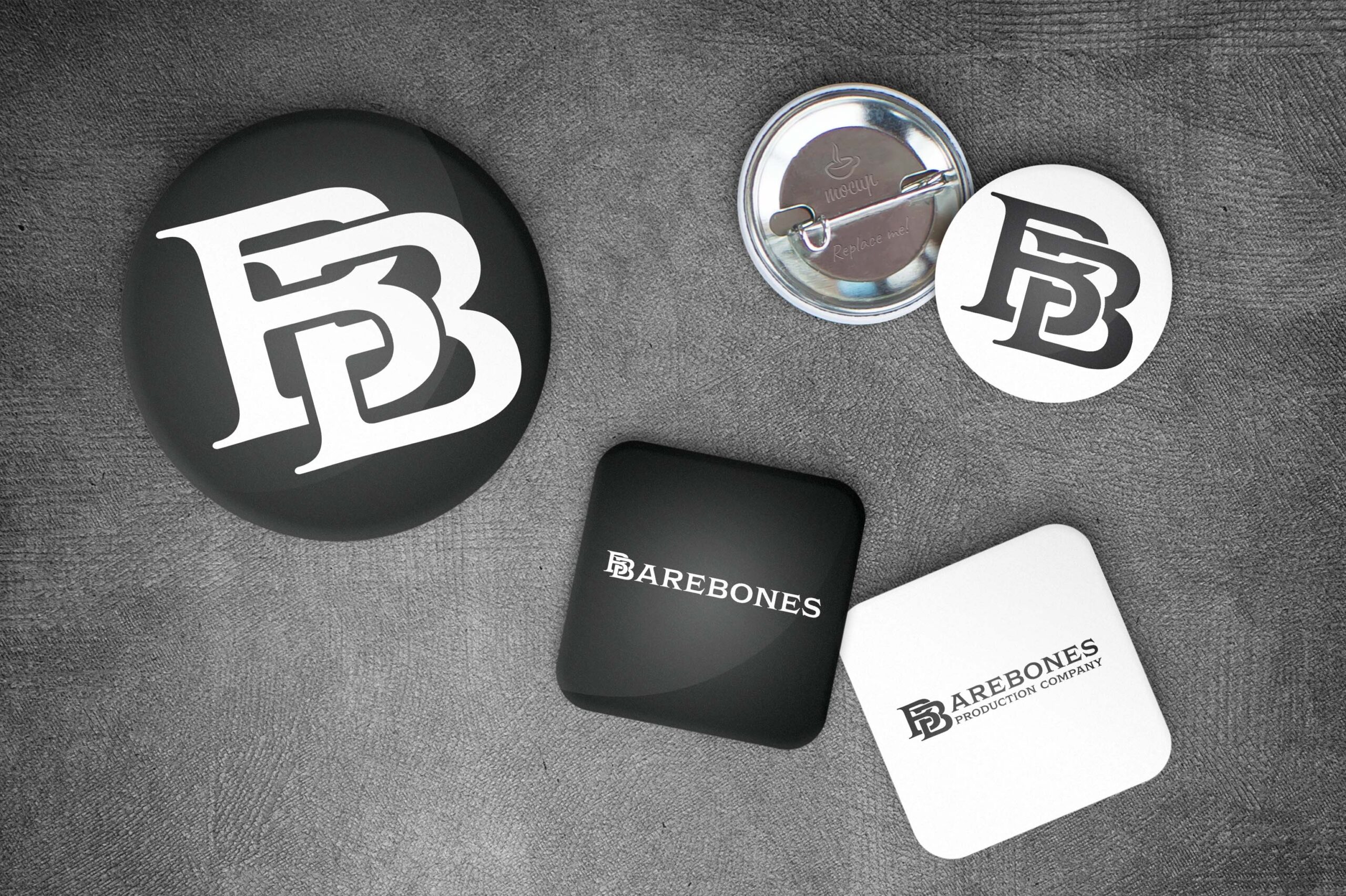
While we never had the opportunity to utilize the Barebones Identity in a physical space, I did create a showcase of the logo as it was intended to be used – both in an administrative sense (tickets, letterhead, and business card) and a merchandising sense (poster, shirts, buttons). For this showcase, I focused on a theoretical “bare bones” production. Shakespeare’s works can be produced without having to pay royalties. There are many works to choose from, but most recognizable is Hamlet. This is a new company, so Hamlet it is.
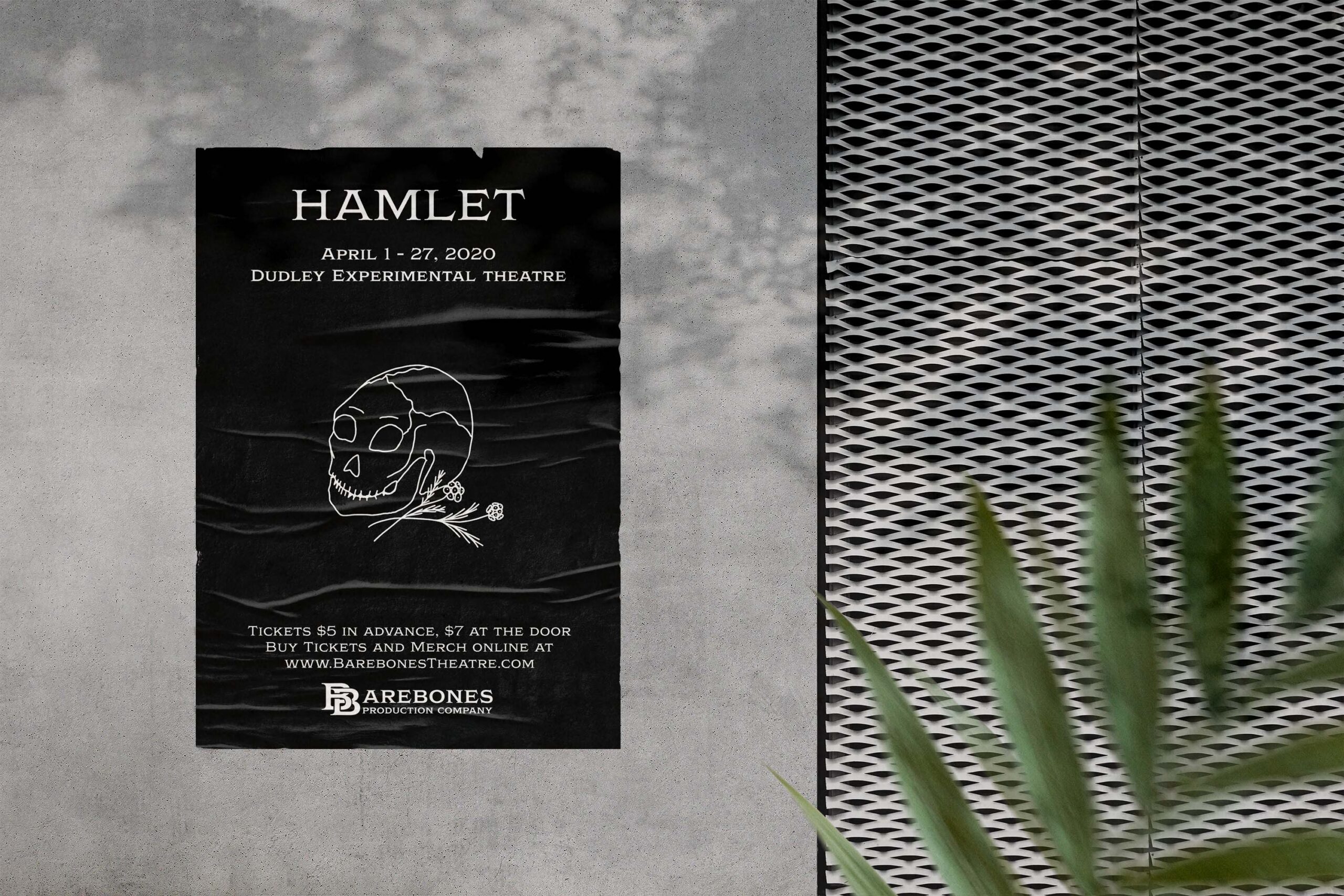
Brochure: Identity at Work
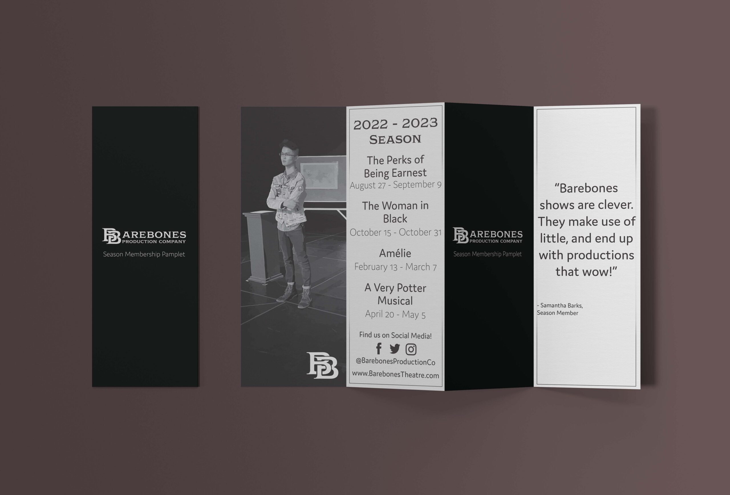
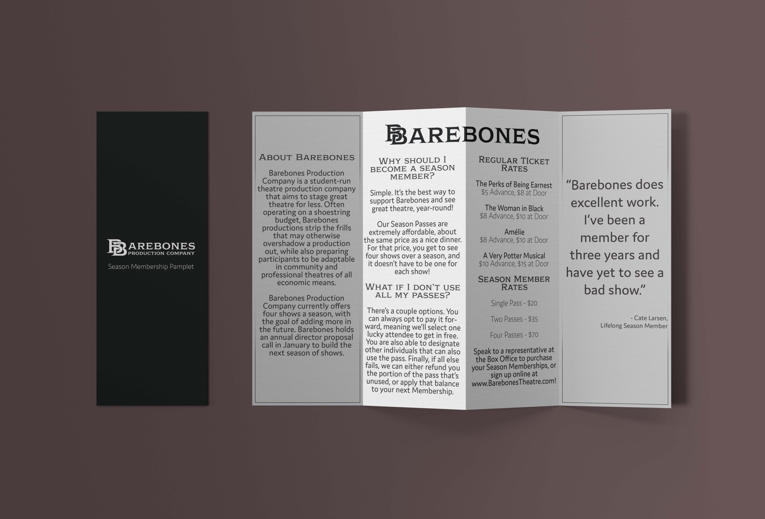
While there are some, limited implementations of an identity system in the above showcase, I wanted to try implementing the system in a larger way.
This Brochure is meant to be folded in a double-gated fashion, and is meant to be a handout for older patrons of Barebones. There are two general types of people who come to UMD shows: Students, and people over 50. People over 50 are more likely than students to be able to purchase subscription bundles, and have the willingness to do so. Selling subscriptions in the first place would allow Barebones to make sure we not only have the budget for the shows we want to put on, but have wiggle room in case of unforseen charges.
With this brochure, I stuck with the grayscale palette originally established above, and added some simple structural elements – a box on certain panels. The first image is the back and exterior: the pure black page with the Barebones logo is the front, while the 2022-2023 season would be the back. Opening the first gate would have the grayscale image of the actor (Which is Deryck Hak in his performance of his show he wrote, Between, with Barebones) on the right, and the patron review on the left. Opening the second gate brings us to the bottom image, where this whole unfolded item would be exactly how the brochure is viewed, with the reason to buy and rates in the middle, and the mission statement and additional review on the left and right, respectively.
