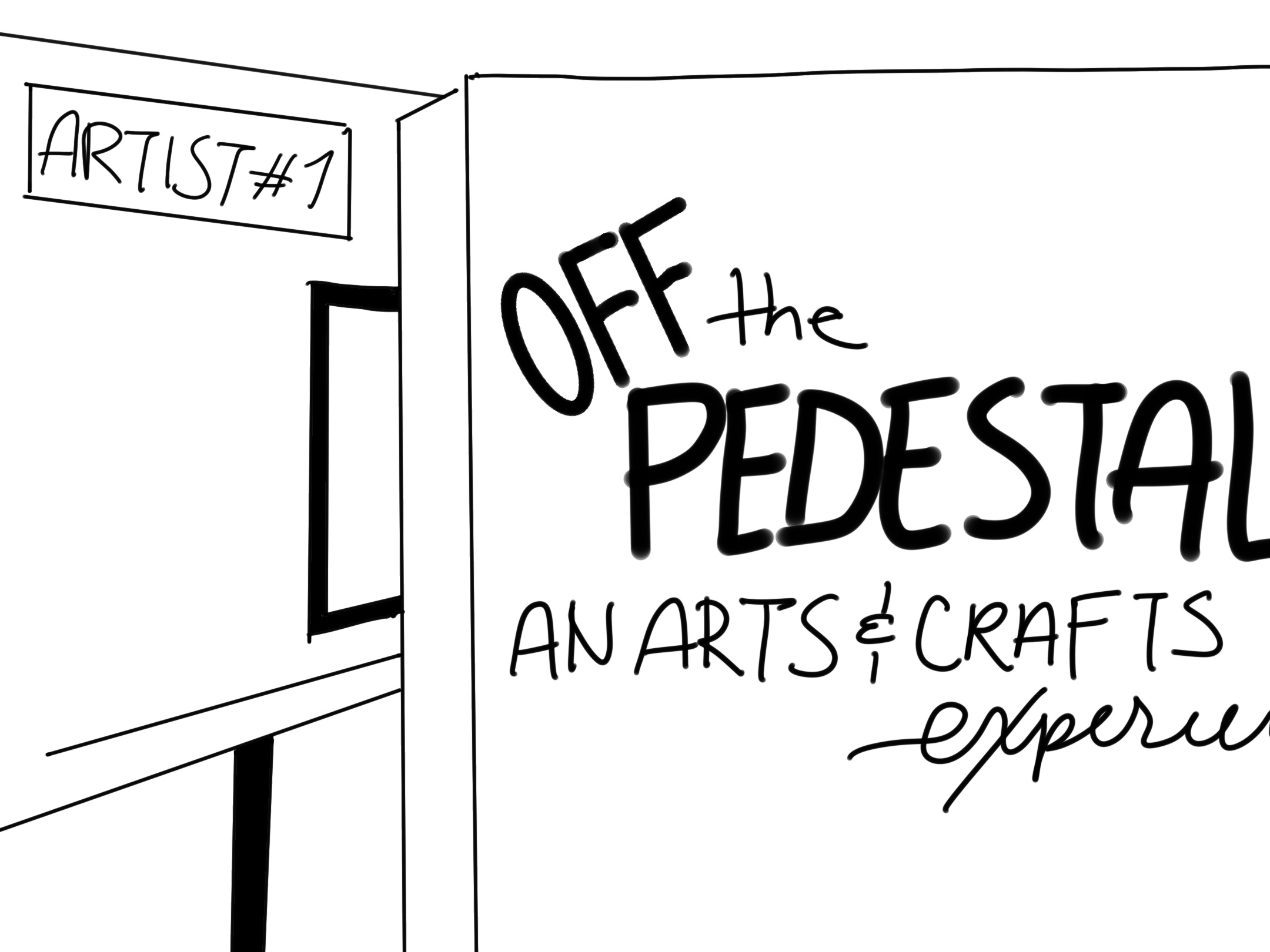
Off the Pedestal:
An Arts & Crafts Exhibition
Project Brief
This was a semester-long project with the end goal of creating an accessible gallery design, specifically for those who are affected by blindness and low vision. The gallery was centered around a specific movement in art history, and once the project was complete it would have an app to aid in navigating the gallery and a working website to serve as a landing area for the gallery.
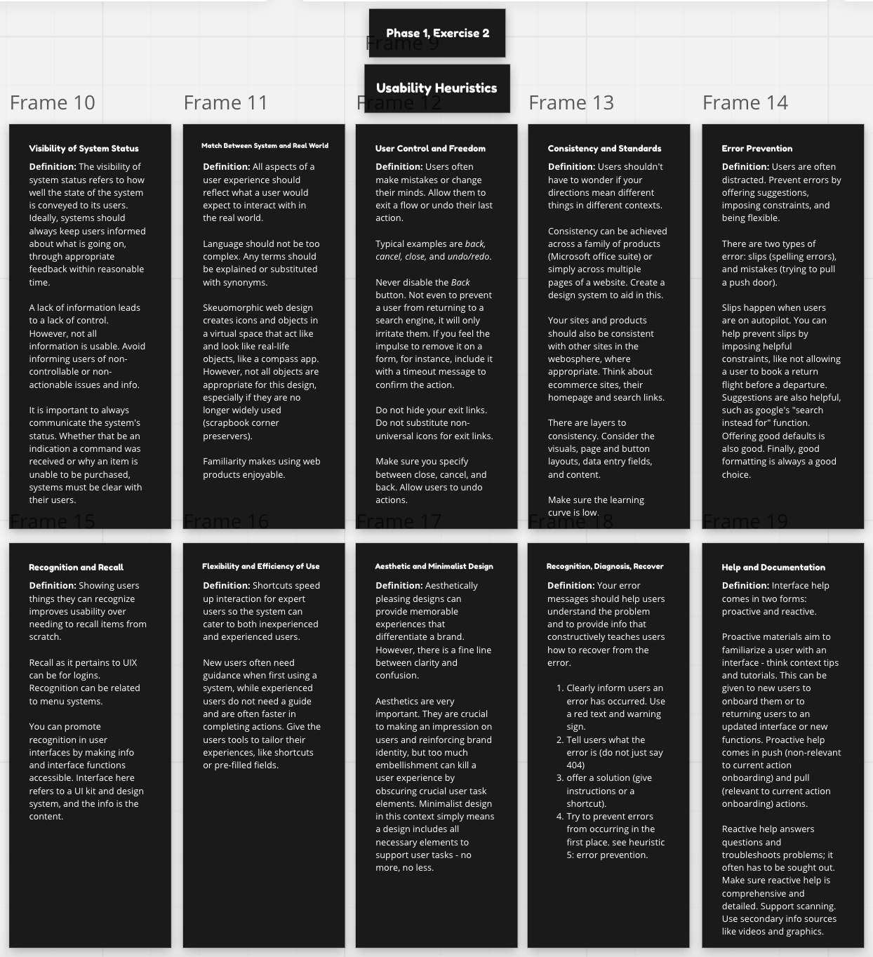
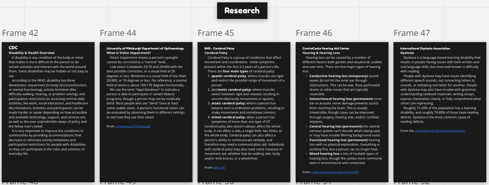
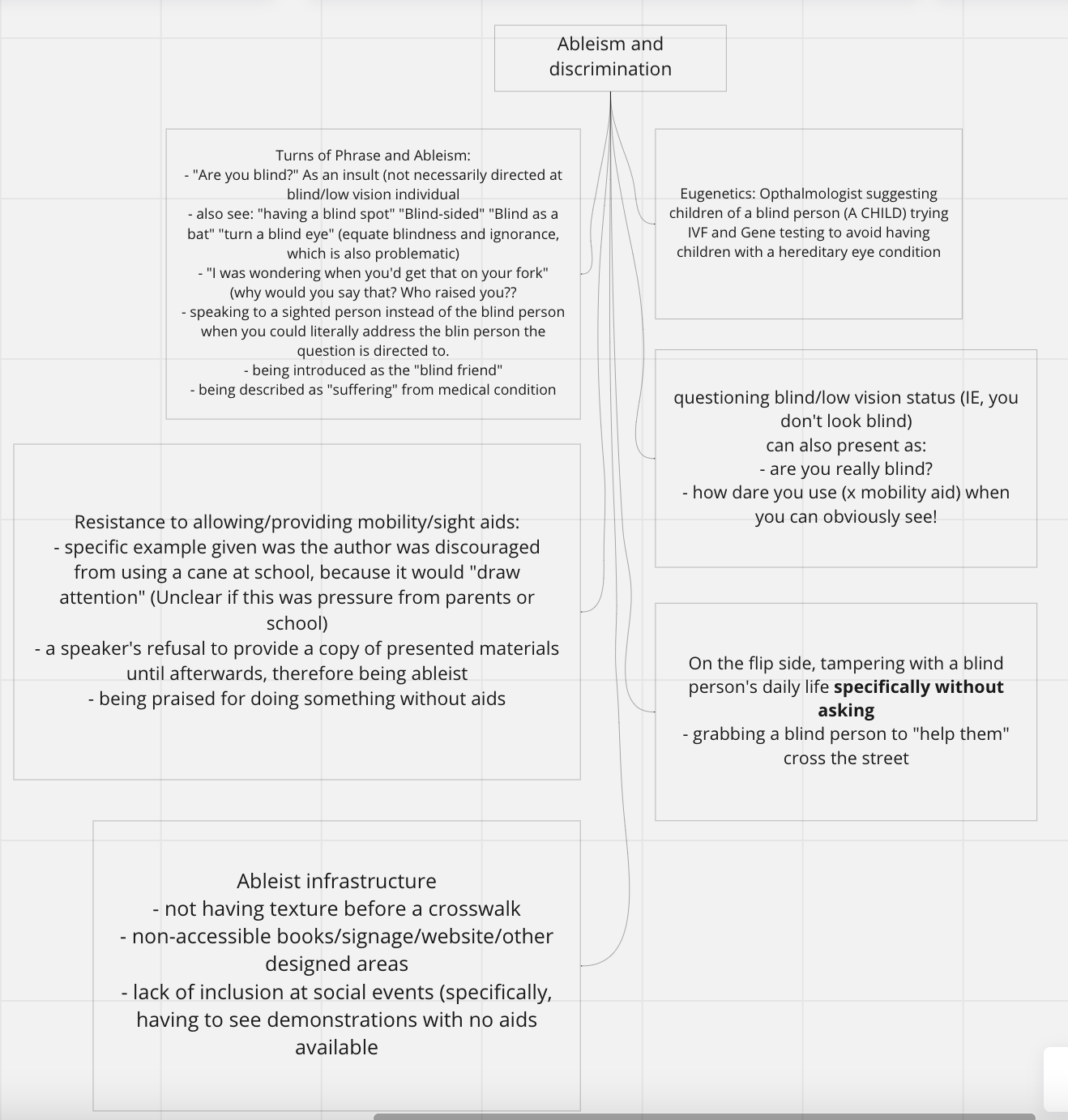
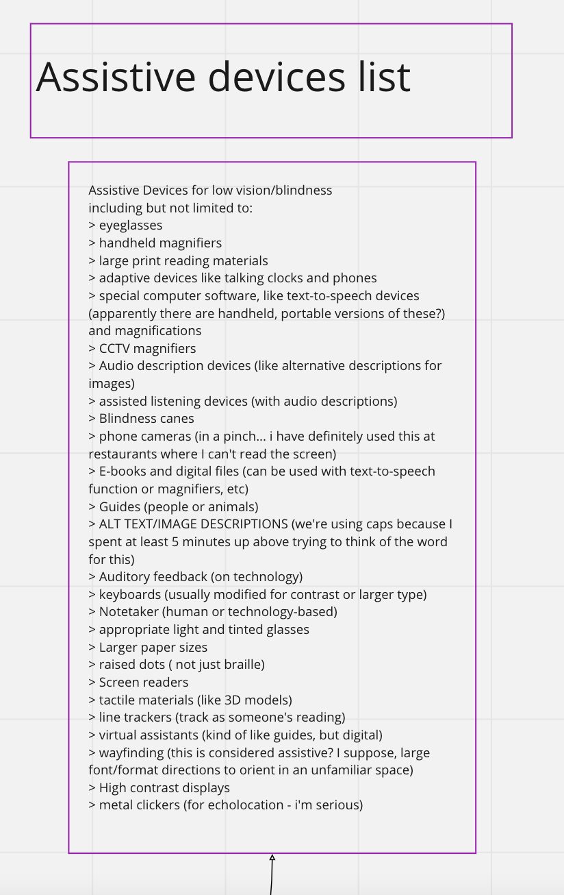
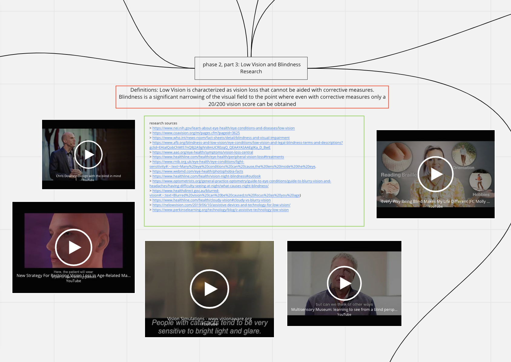
Preparatory work for creating this project was rigorous, with a lot of research done into different types of blindness and low vision and their causes, UX requirements and how they can help people with disabilities, other types of disabilities (such as Cerebral Palsy, Dyslexia, and Muscular Dystrophy), as well as ableism. Sequentially, this project was done after Eight Summits, which also addressed issues such as WCAG guidelines and the importance of Contrast Checking and Dyslexia-friendly fonts, and these standards were also implemented.
I did two Miro boards covering those topics and more, which you can view by clicking the buttons, or you can view the highlights in the gallery.
First Phase: Gallery Design
Before developing the app and website, the physical thing had to exist. At least, in theory.
For my Gallery, I chose the Arts and Crafts movement. For the uninitiated, we’re not talking about yarn and googly eyes. The Arts and Crafts movement occurred in the late 1870s to early 1900s and was a direct response to industrialized, commercially (and poorly) made furniture that was becoming popular. It was Art, but it was functional and made to last.
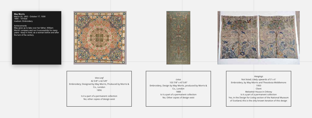
The first thing that needed to be done was to choose the artists. I tried to get a mix of men and women across multiple disciplines, from pottery to stained glass to furniture to housewares to fiber arts.
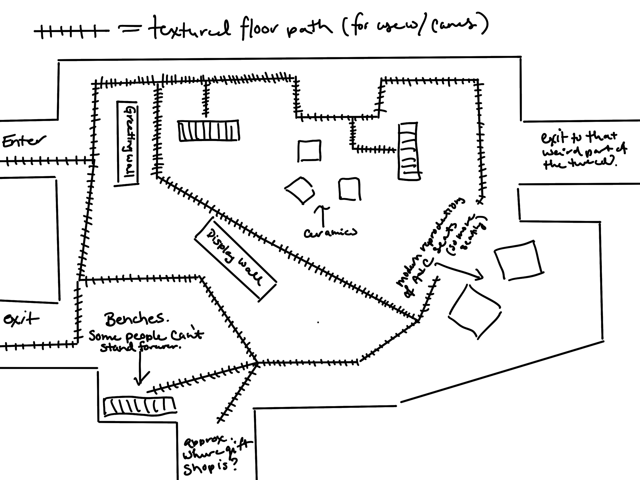
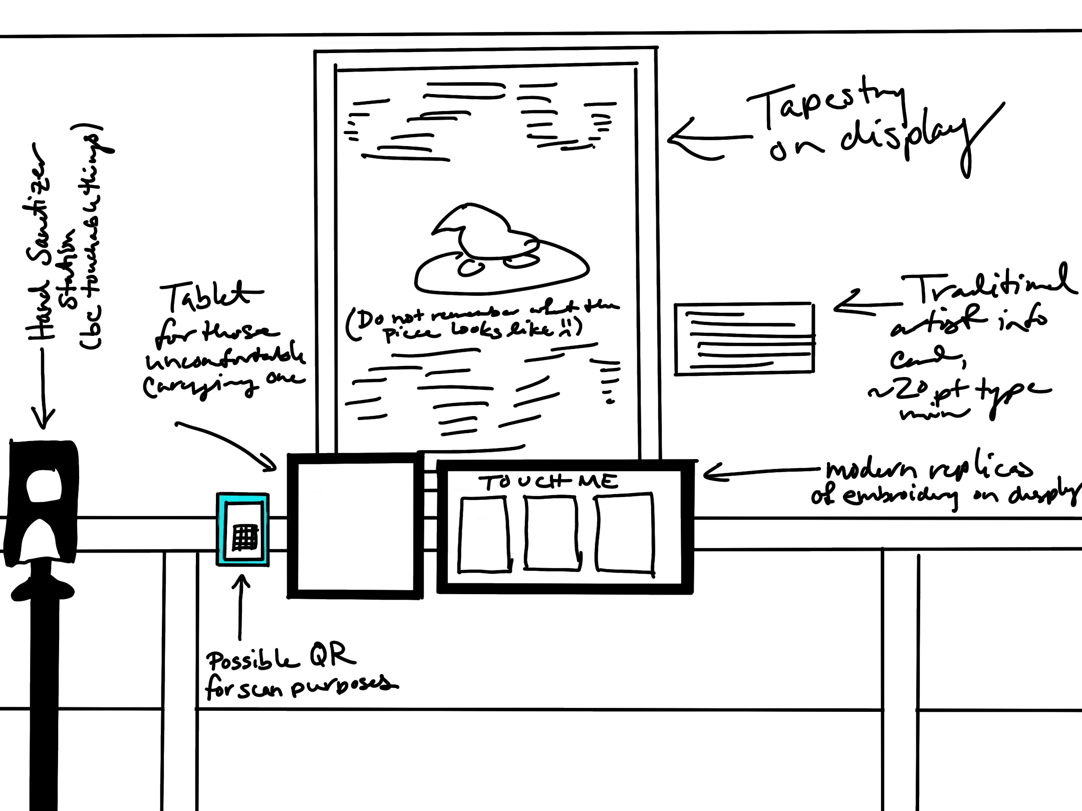
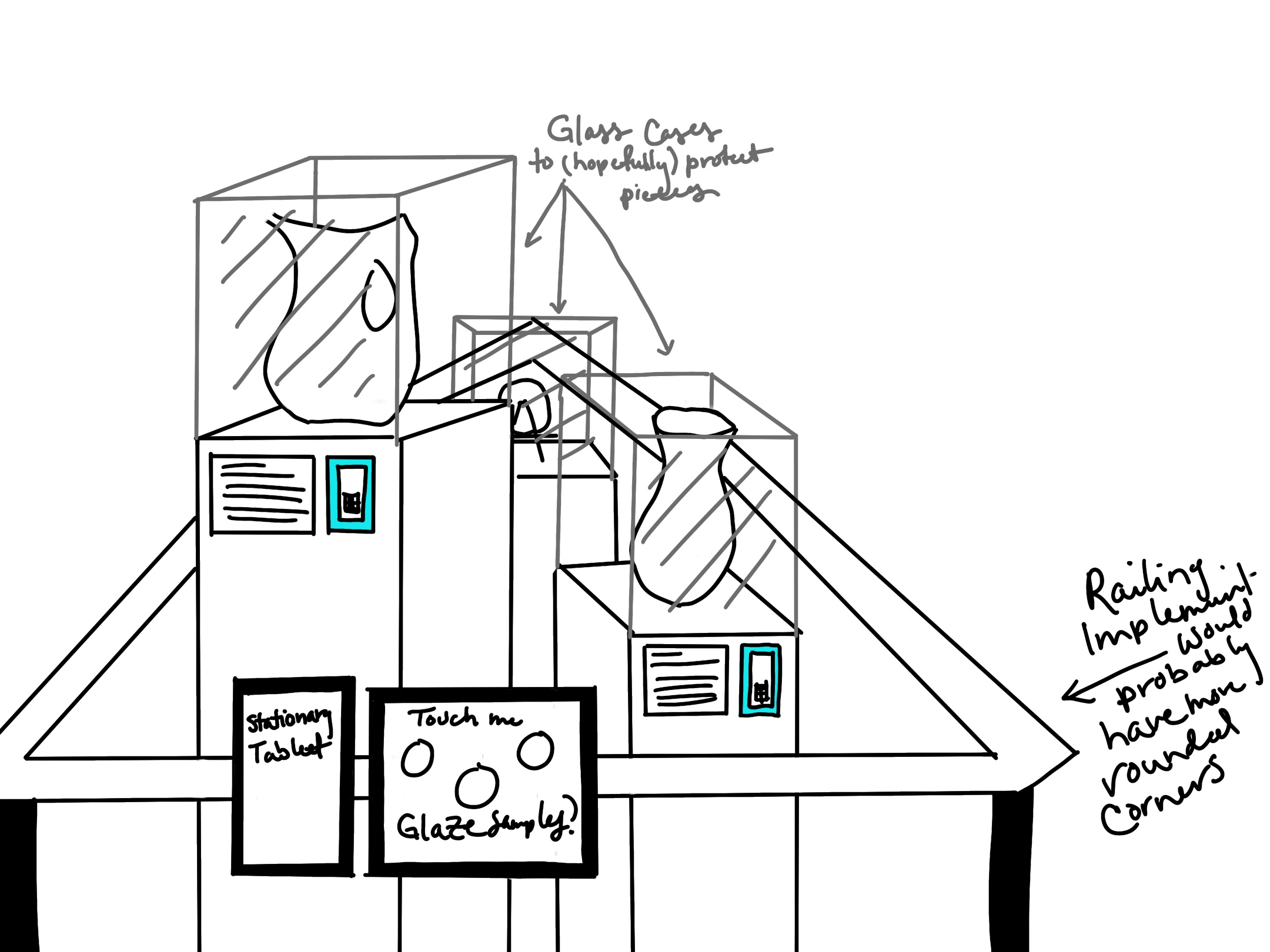
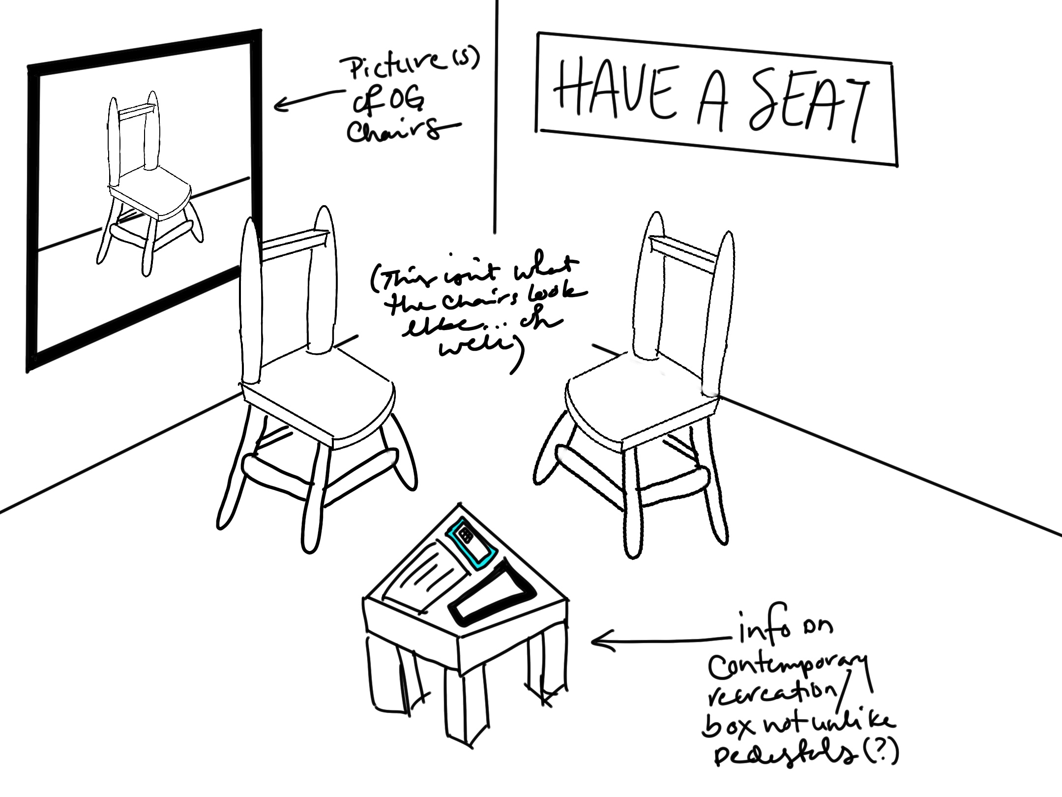
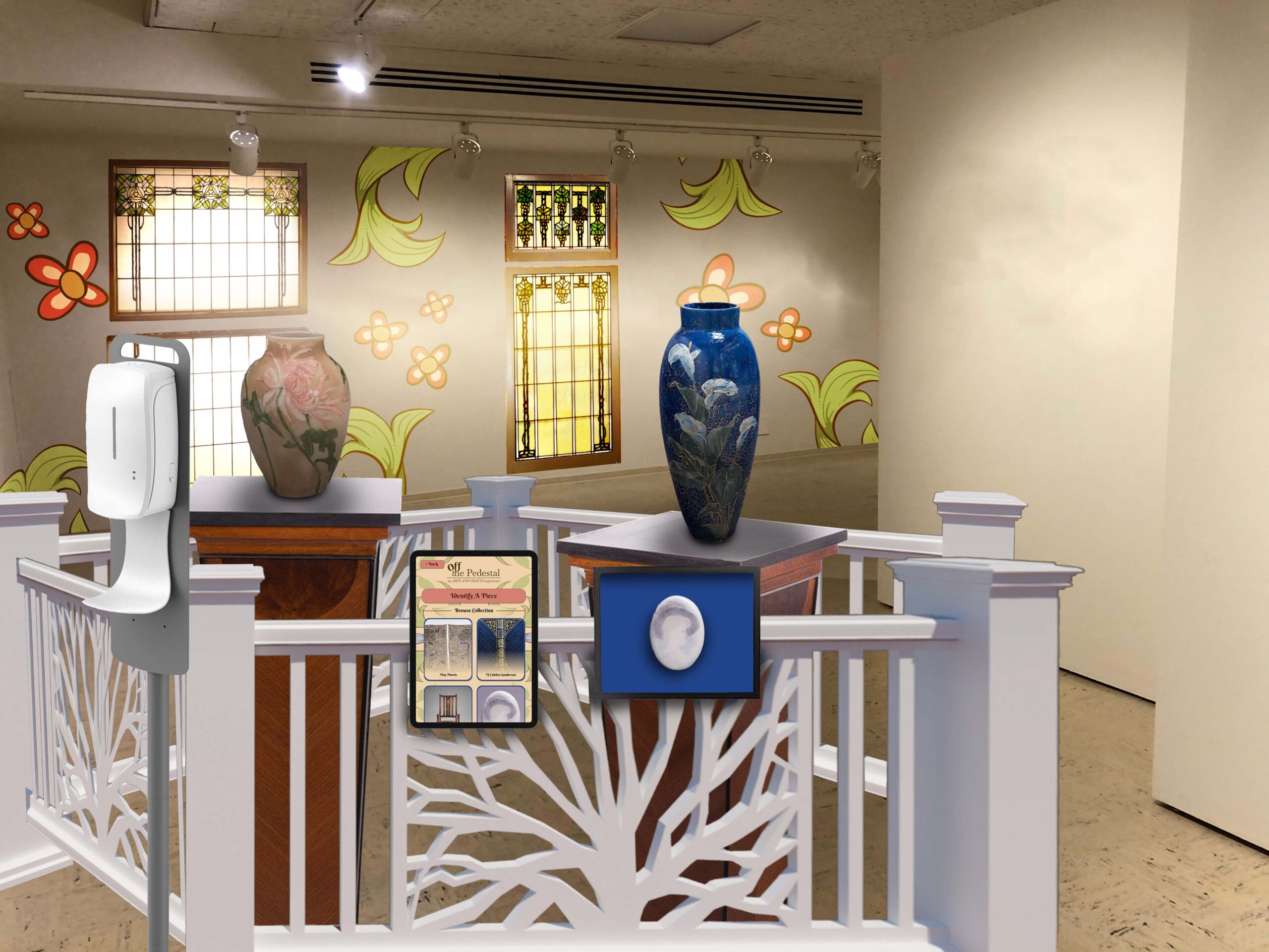
Next was to figure out how I wanted my gallery to be experienced. Keeping in mind my main focus was supposed to be on those with low vision and blindness, I came up with a few ideas on how to make this gallery less a “look and don’t touch” kind of traditional gallery, and more of a multisensory, accessible gallery. There were a couple ways I went about this, from recreations of chairs you could sit on, to replicas of needlework you could touch, to textured paths on the floor for those using canes to navigate with.
I also thought about catering to different types of disability as well, though. We have, in addition to tablets with the app you can carry with you, stationary tablets, handles instead of knobs on the doors, and plentiful benches for people to sit on in addition to the replica chairs.
Website
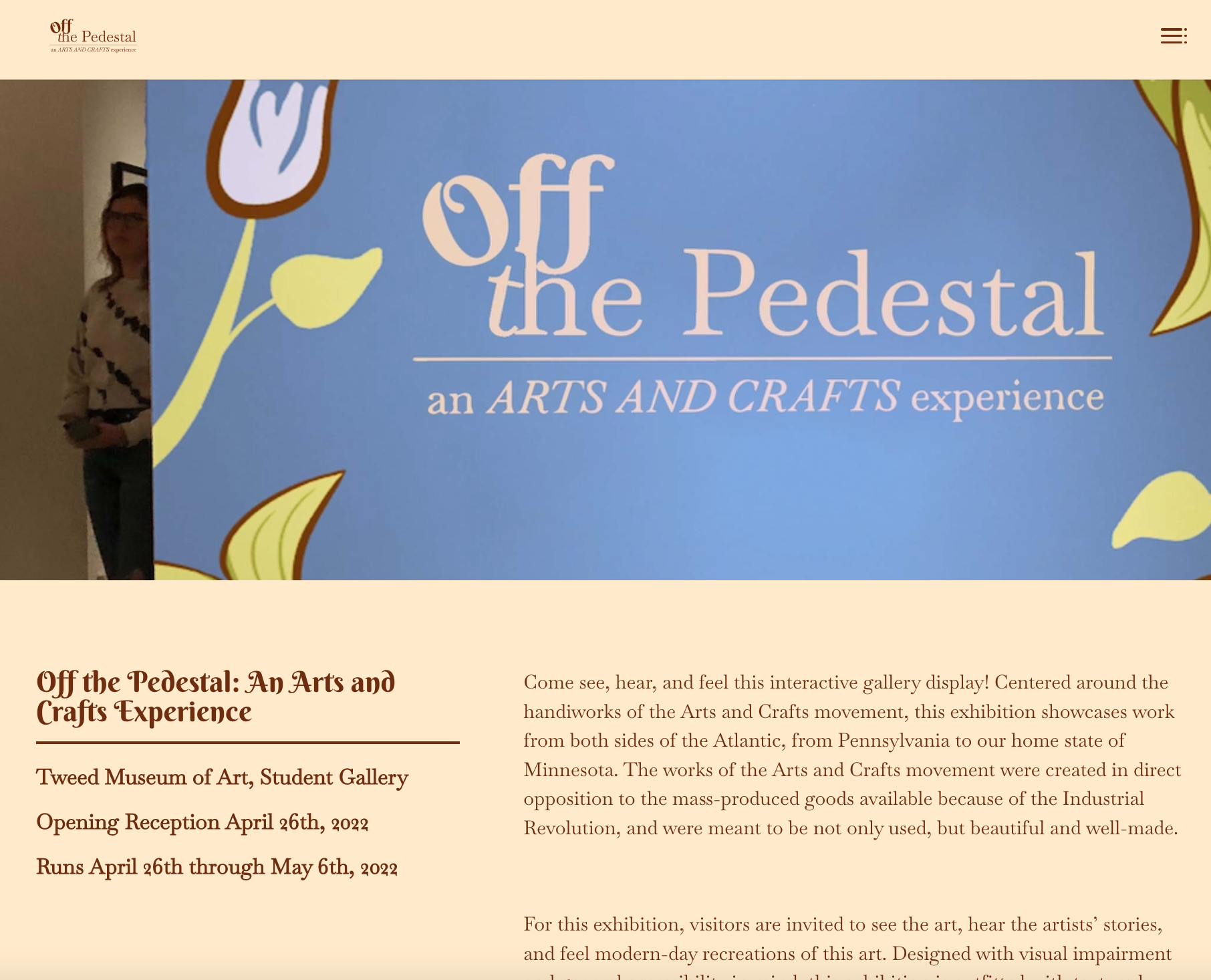
The Website is meant to serve as a first touch point for potential visitors. Modeled in a similar way to the landing pages of the Minneapolis Institute of Art, Walker Art Museum, and MET, the website features three pages: A front page, an about, and a contact page. You can still view the website by clicking the button below.
Tablet App Design
Building the tablet app was, by far, the most robust part of this project. As you can probably tell, the app was built to be used with a tablet, not a phone or desktop.
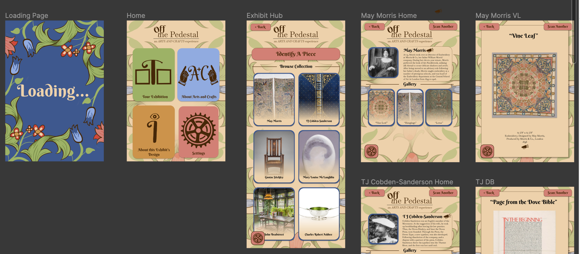
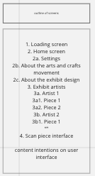
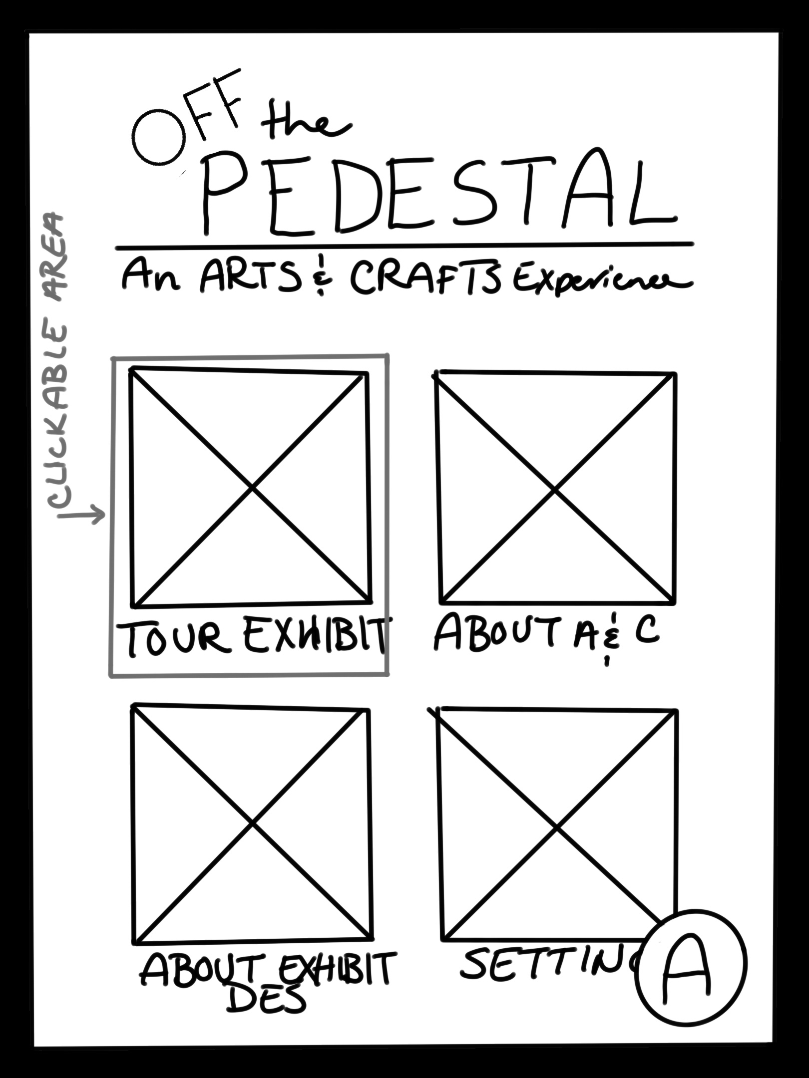
The first thing I did was determine what information was absolutely necessary to include in the app. This ended up encompassing four things:
- the settings, so users could customize their experience for their level of ability.
- Information on the Arts and Crafts movement; this is a gallery show, after all.
- Information about the exhibit design. This widget was getting a little meta, I’ll admit, but in the theoretical sense of this gallery being real, this posed a wonderful learning opportunity for abled folks to learn what accessibility actually looks like, because, let’s face it: the US kind of sucks at it. I’ll get off my soapbox.
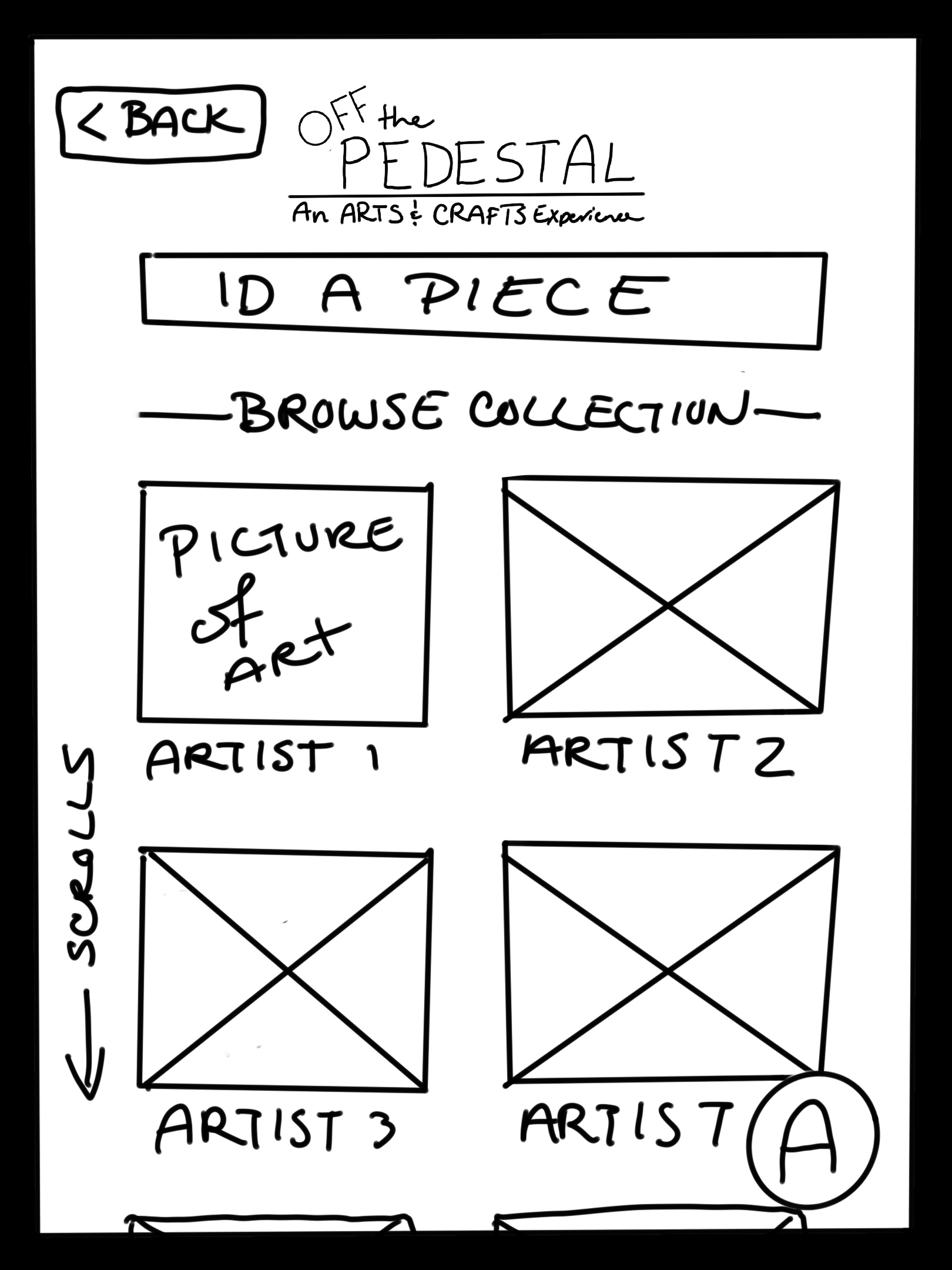
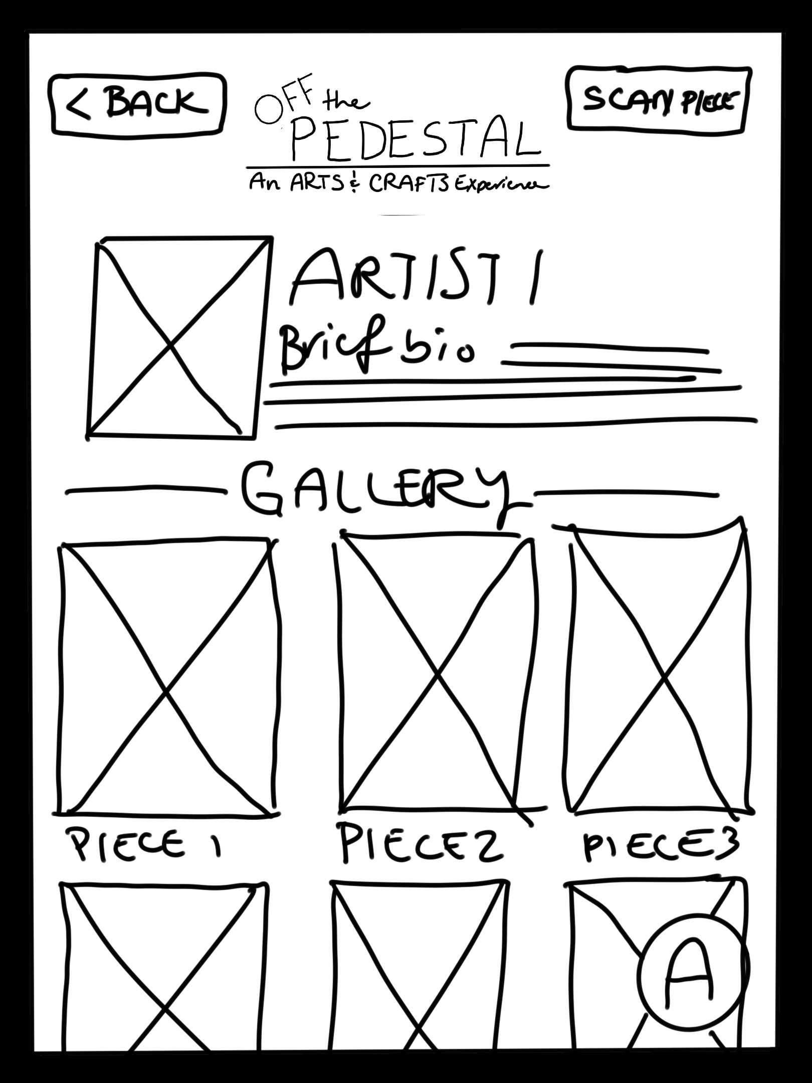
- Information about the artists and their pieces. (Spoiler, this turns into the meatiest part)
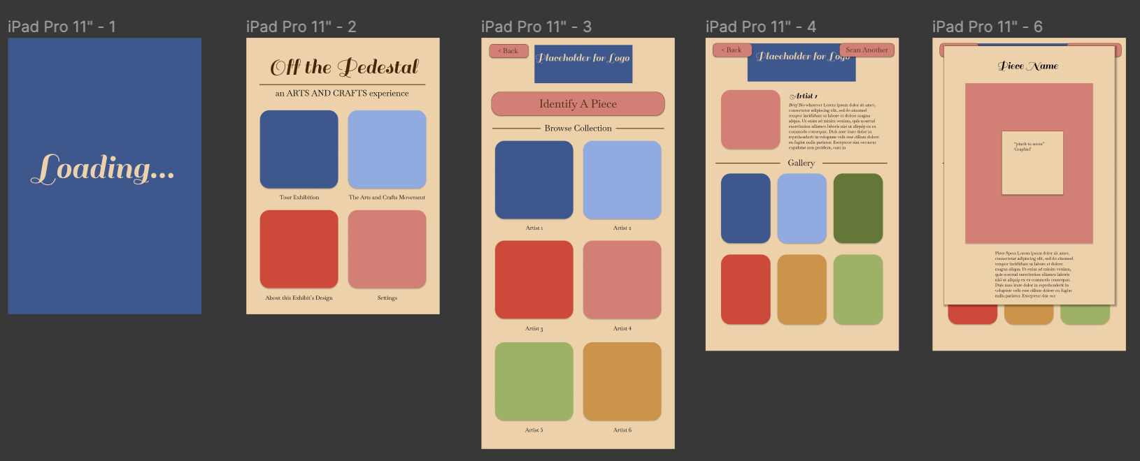
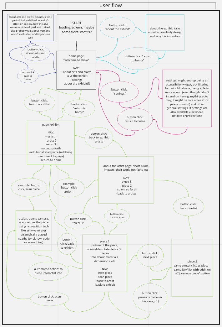
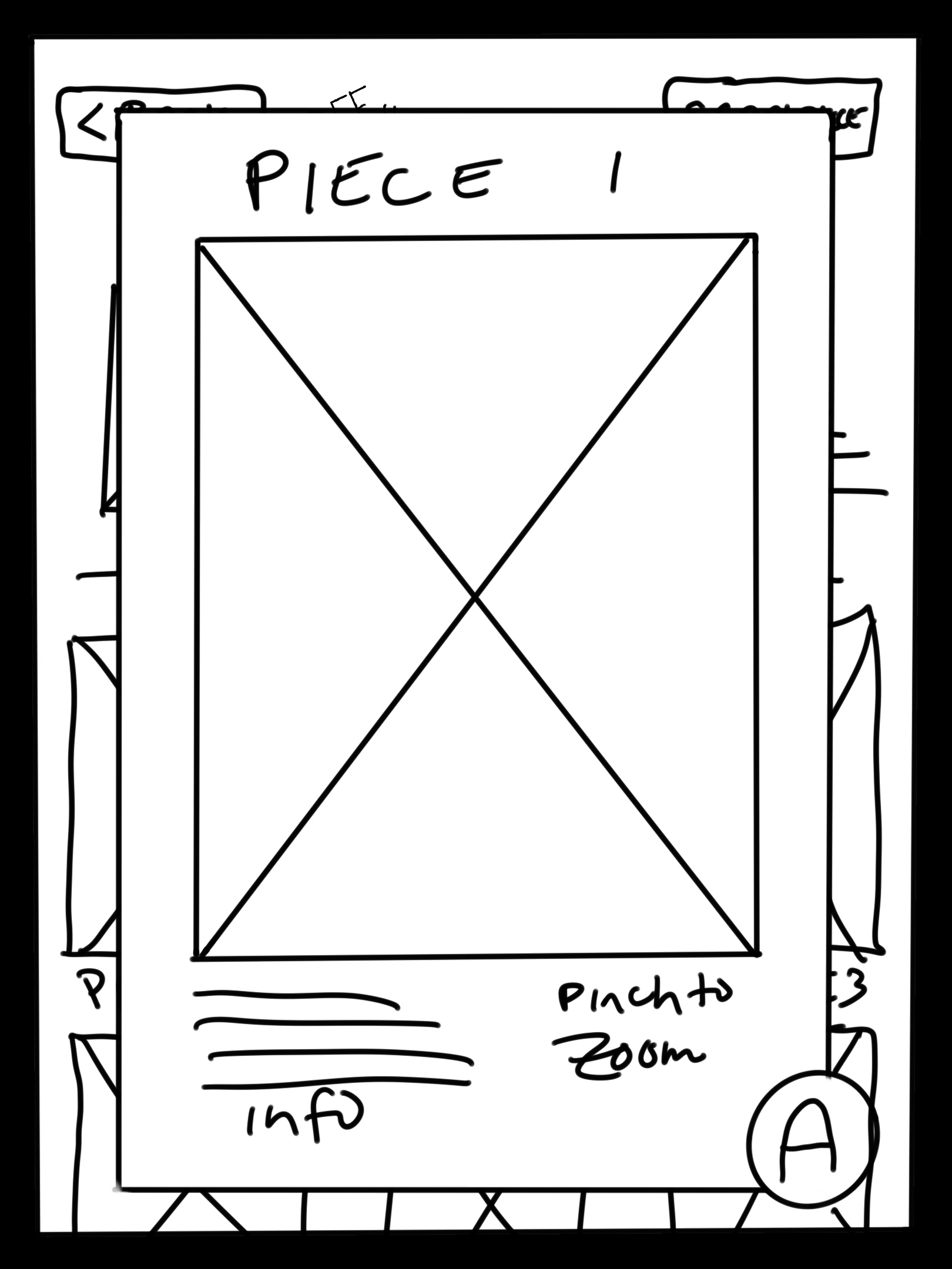
Next was determining what that flow would look like, and then what the actual pages would look like. Those are within the slideshow.
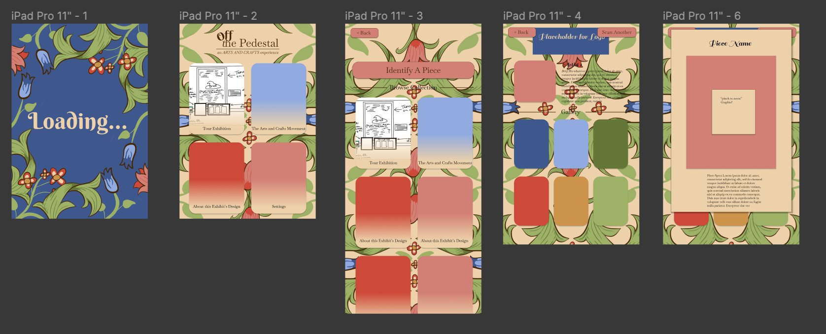
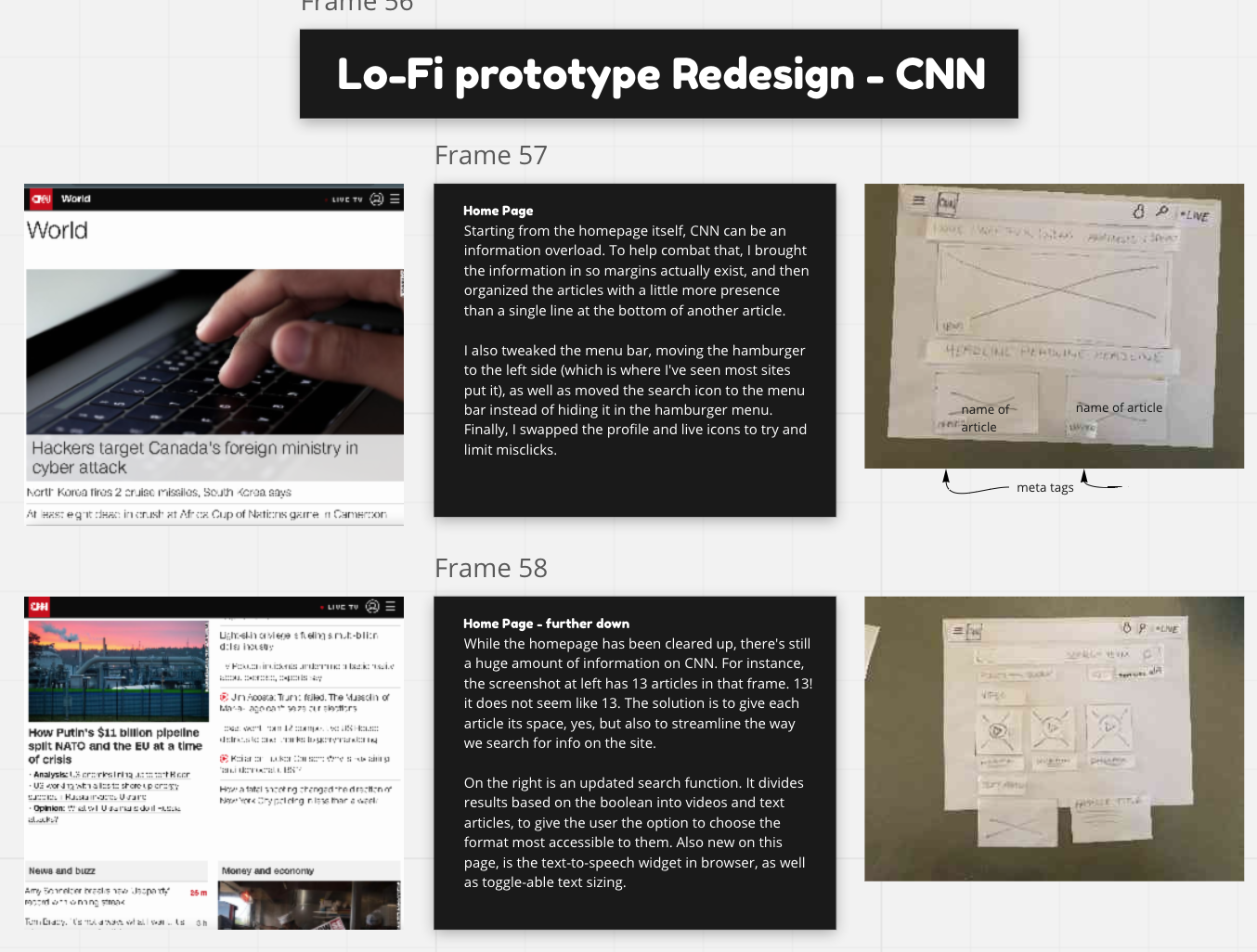
The app itself was prototyped using Figma with images and widgets created with Procreate and Photoshop. Colors were checked for correct contrast with WCAG, as well as using a dyslexic-friendly font for the bulk of the app. (I am unsure if Berkshire Swash is, I apologize.)
Building out the prototype went through a couple visual iterations to optimize the app for readability. The initial idea was to have pictures in the section navigation buttons, but I ended up going with icons instead, so as not. todrown out the type. I kept the pictures for the artist profiles. I chose to use pictures of their art to make it easier to find the pieces visitors were looking for rather than guess based on their picture.
The app was prototyped in Figma and can be clicked through. I ran into a problem pretty rapidly, in that Figma was deleting my prototype paths and forgetting my commands for placement with some assets. This has been fixed for the most part. You can watch a quick example of how the app works in the video, or click the button to go through the prototype yourself.
